Client
_
Services
_
Synopsis
_
Brand Identity
Infographics
Web Design
Syzygy Plasmonics
Syzygy Plasmonics aims to decarbonize the chemical industry, which is currently responsible for almost 20% of industrial CO₂ emissions. Syzygy uses light instead of combustion to drive chemical reactions. Their Rigel™ reactor cells channel light into high-efficiency photocatalysts, delivering a lower-carbon and lower-cost solution for chemical producers.
Syzygy Plasmonics: Provided original logo
Talia Bromberg: Co-Web Designer


Some slight spacing and thickness adjustments were made to Syzygy’s existing logo.
Brand Identity
Before diving into the supporting brand, I made some small recommended adjustments to the existing Syzygy Plasmonics wordmark.
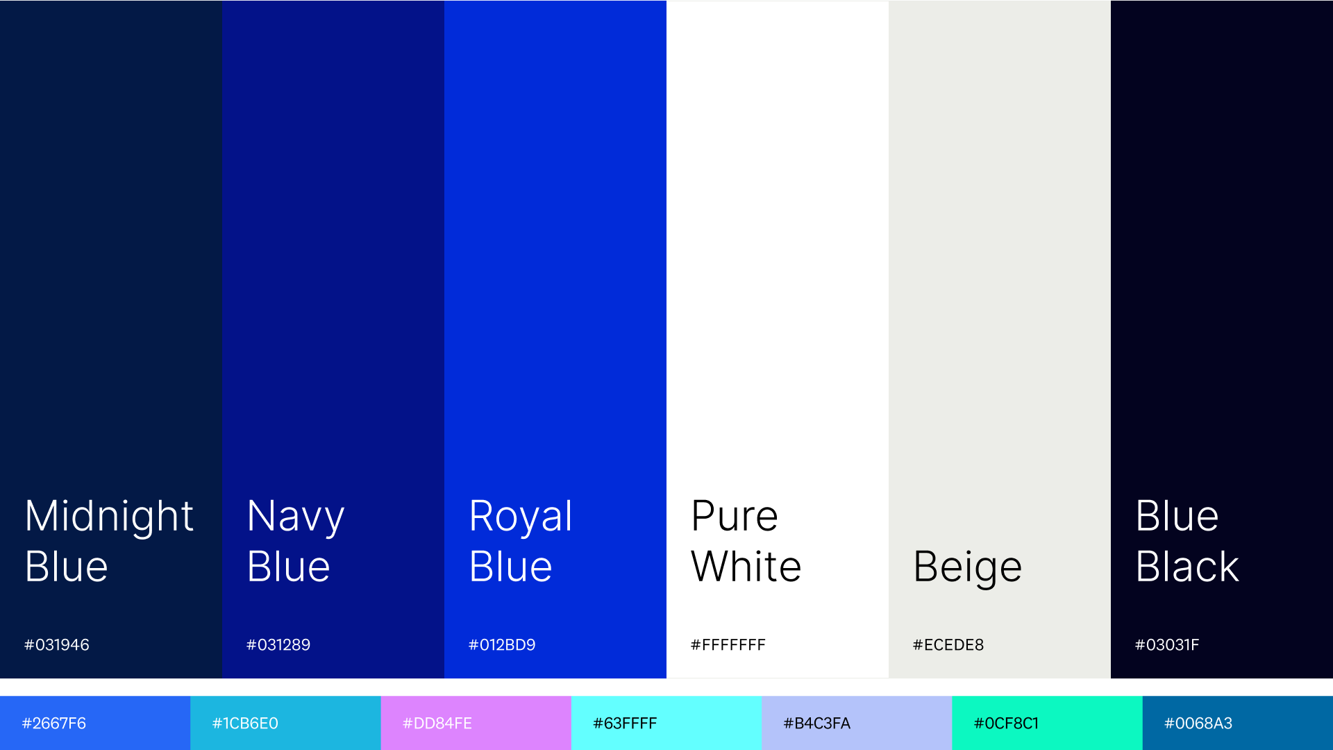
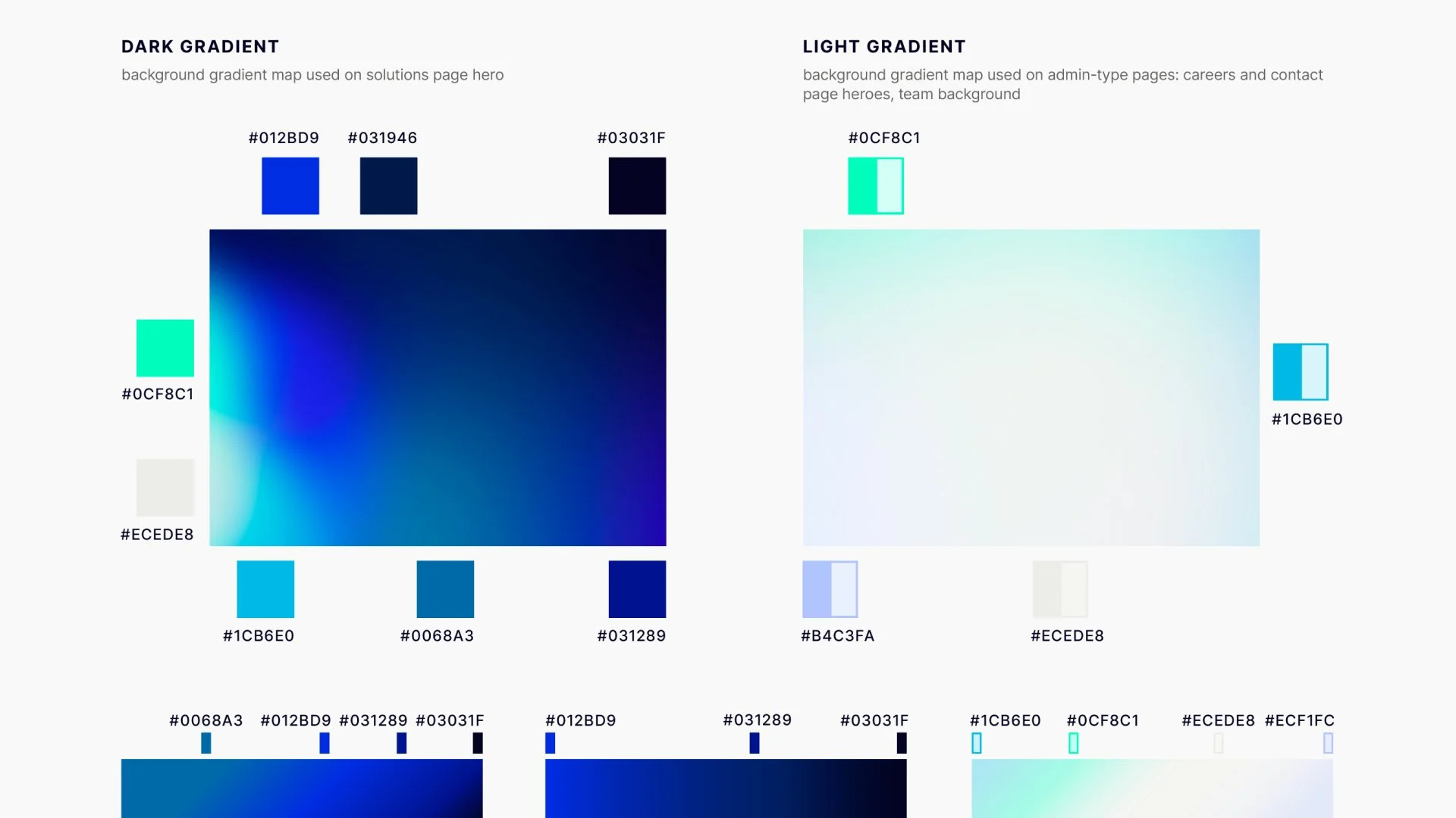
Blue was already a part of the existing established brand. Using that as our starting point, I explored a range of supporting colors for the extended palette, and settled on some bright shades of cool colors, which are mostly used in the brand gradient maps, infographics, and charts.
Website
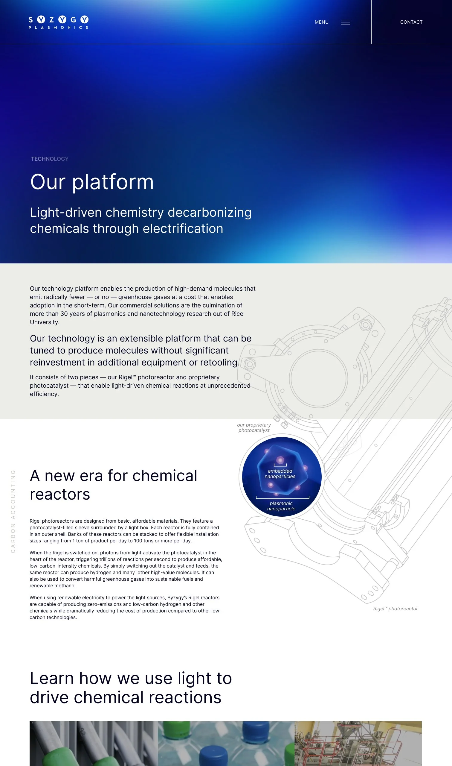
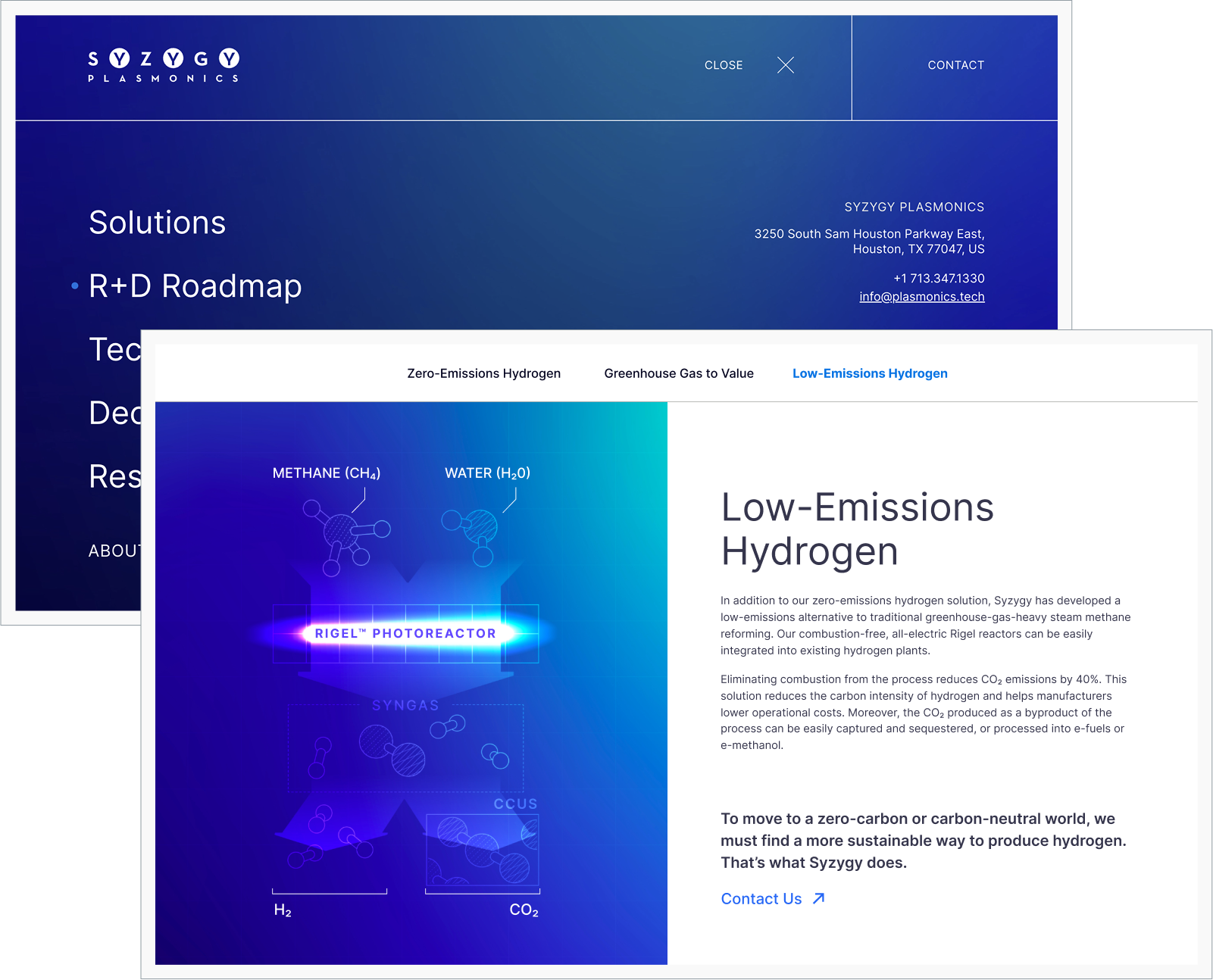
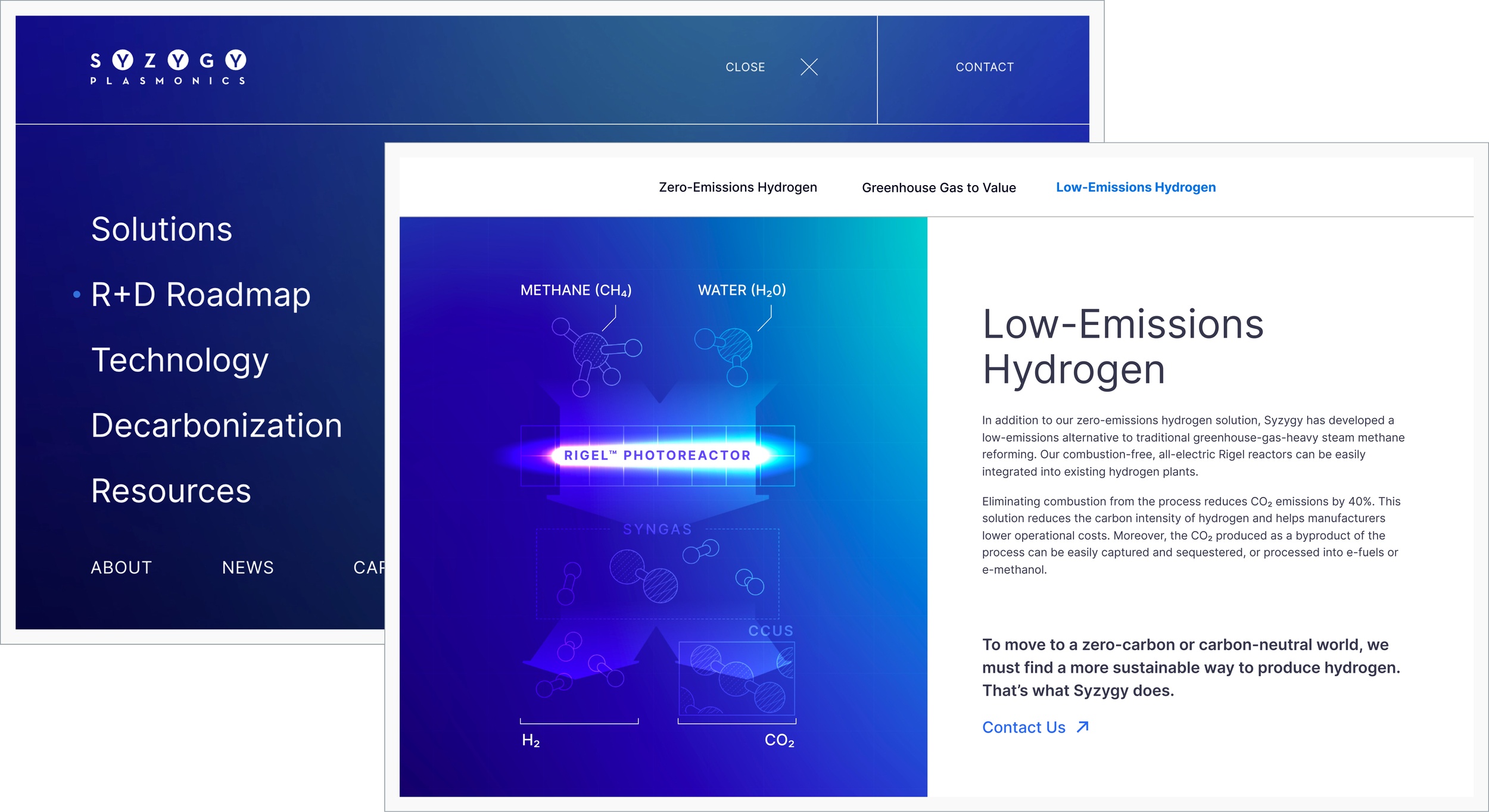
LED light is a main component of Syzygy’s technology, so glow effects and bright colors were a source of inspiration for the palette, illustrations, and hover effects. The hero illustration is an abstract representation of Syzygy’s Rigel™ device (abstracted substantially due to client concerns of giving away any of the patented technologies), and the hero area has a glowing cursor effect on desktop.
The web design was created in collaboration with colleague Talia Bromberg.
Guidelines
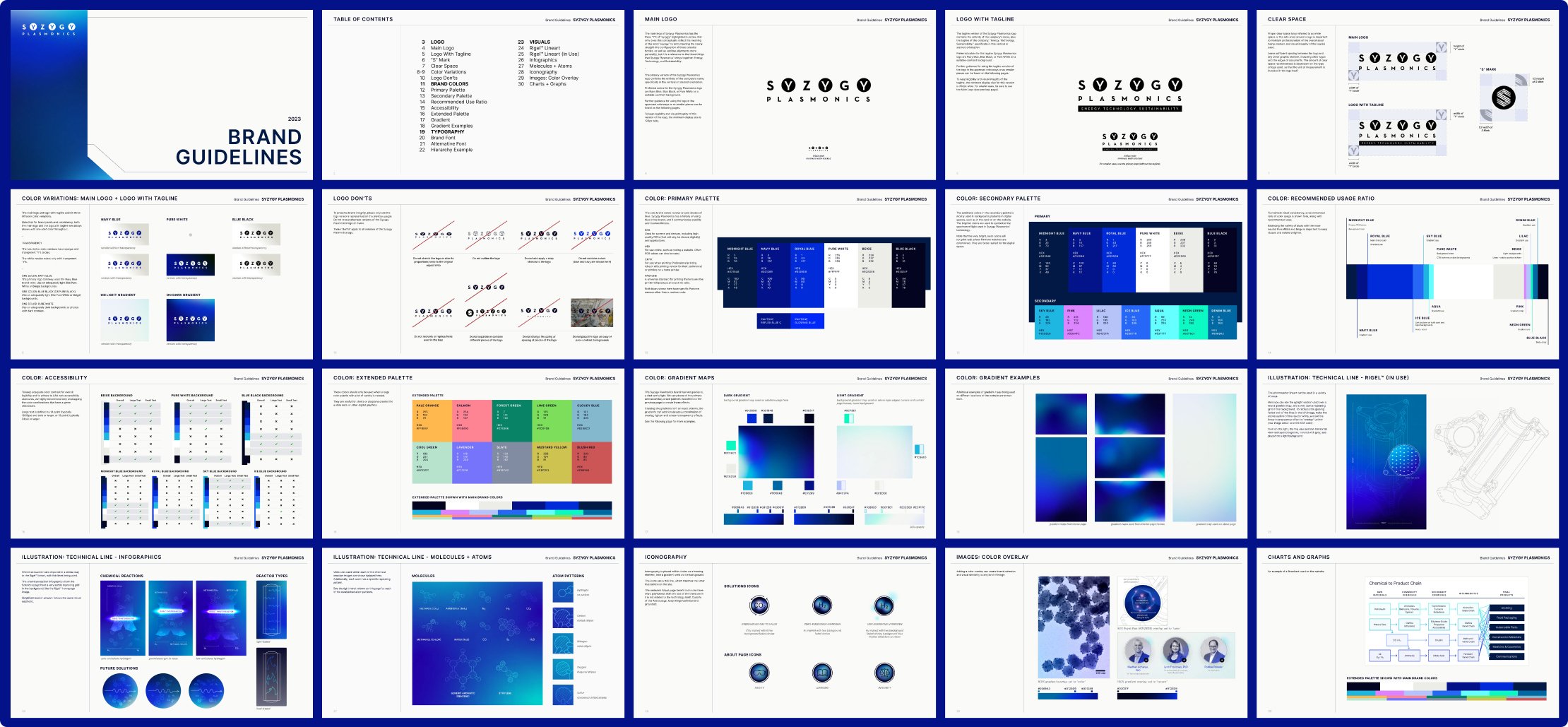
I created an extensive brand guideline document, detailing gradient creation and usage, color overlays, technical line illustrations, and more.
Molecule Illustration System
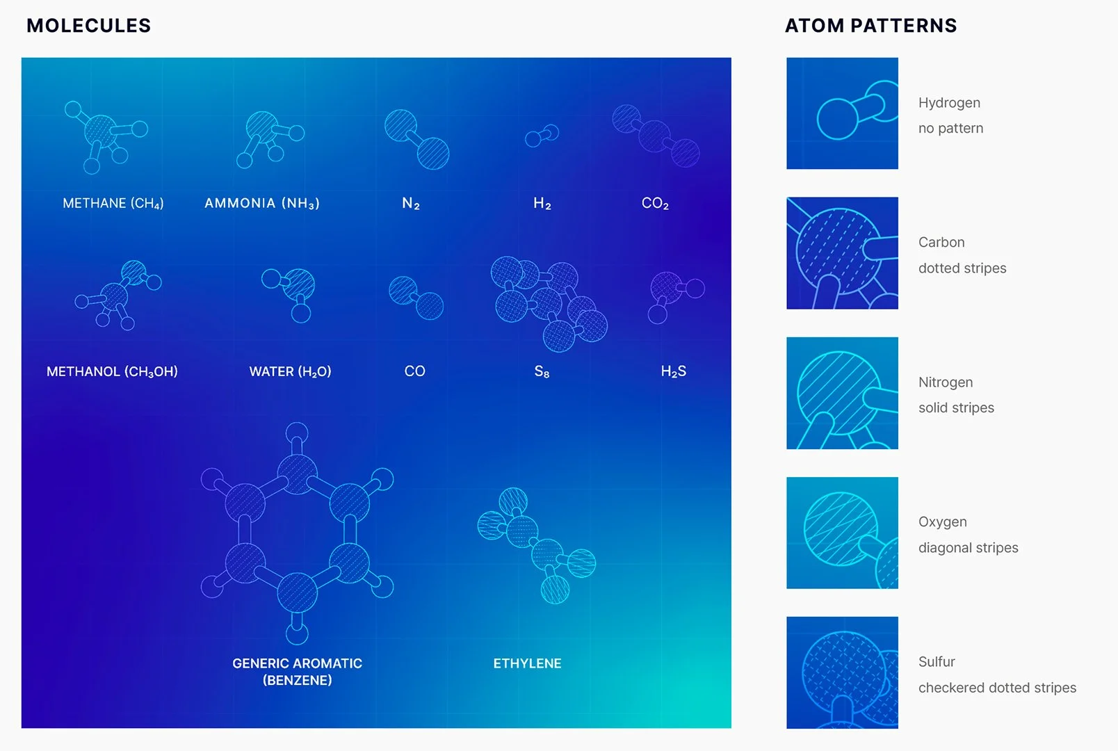
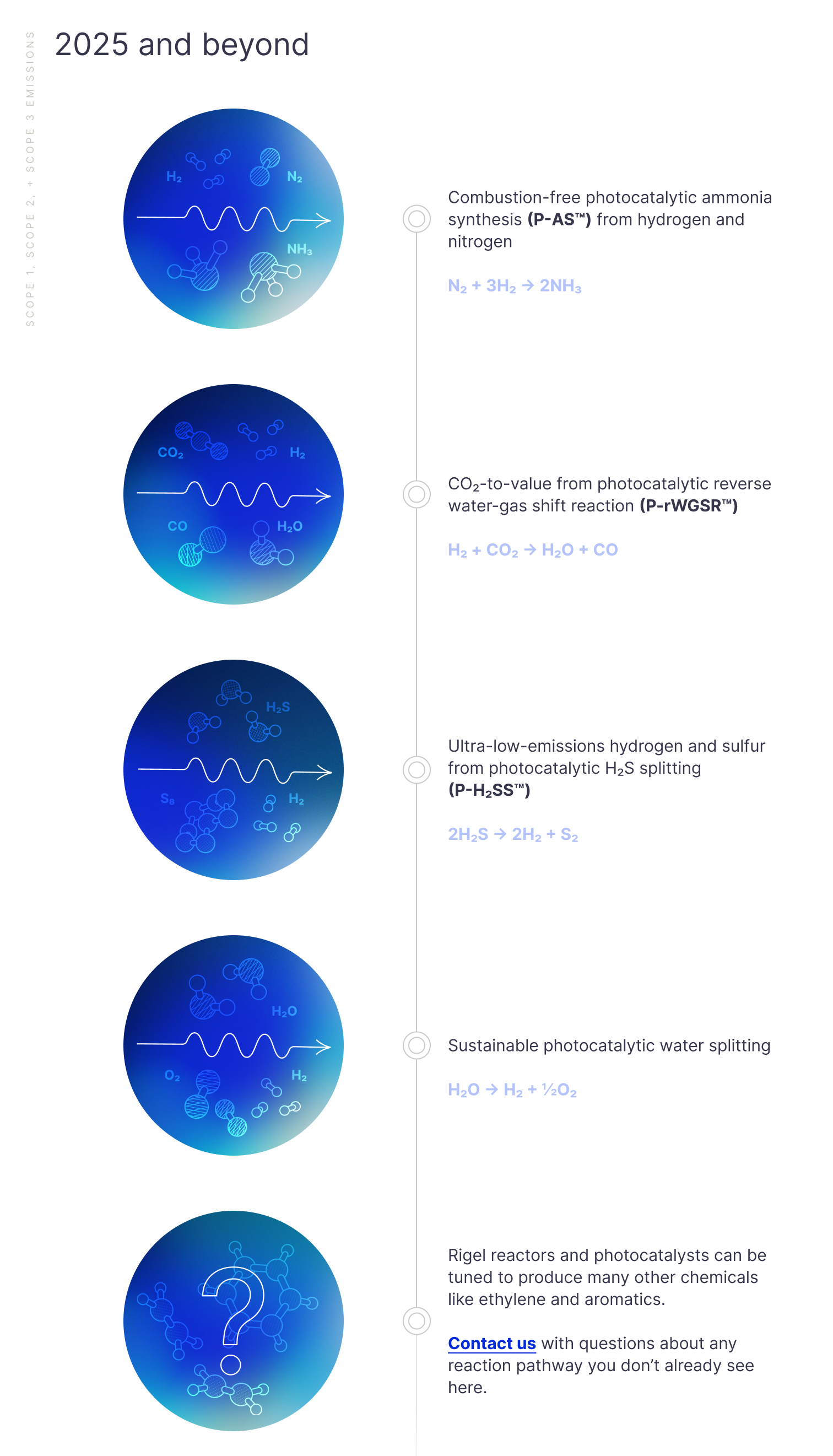
Because of anticipated scientific breakthroughs, I included a specific page in the brand guidelines detailing each Syzygy-relevant molecule, and the pattern that was associated with each individual atomic element, so that webpages and decks could be quickly updated with new illustrations.
Additional Webpages
I created line art of the Rigel™ device for use on the platform webpage, which spanned sections and slightly broke the grid to add some visual interest.
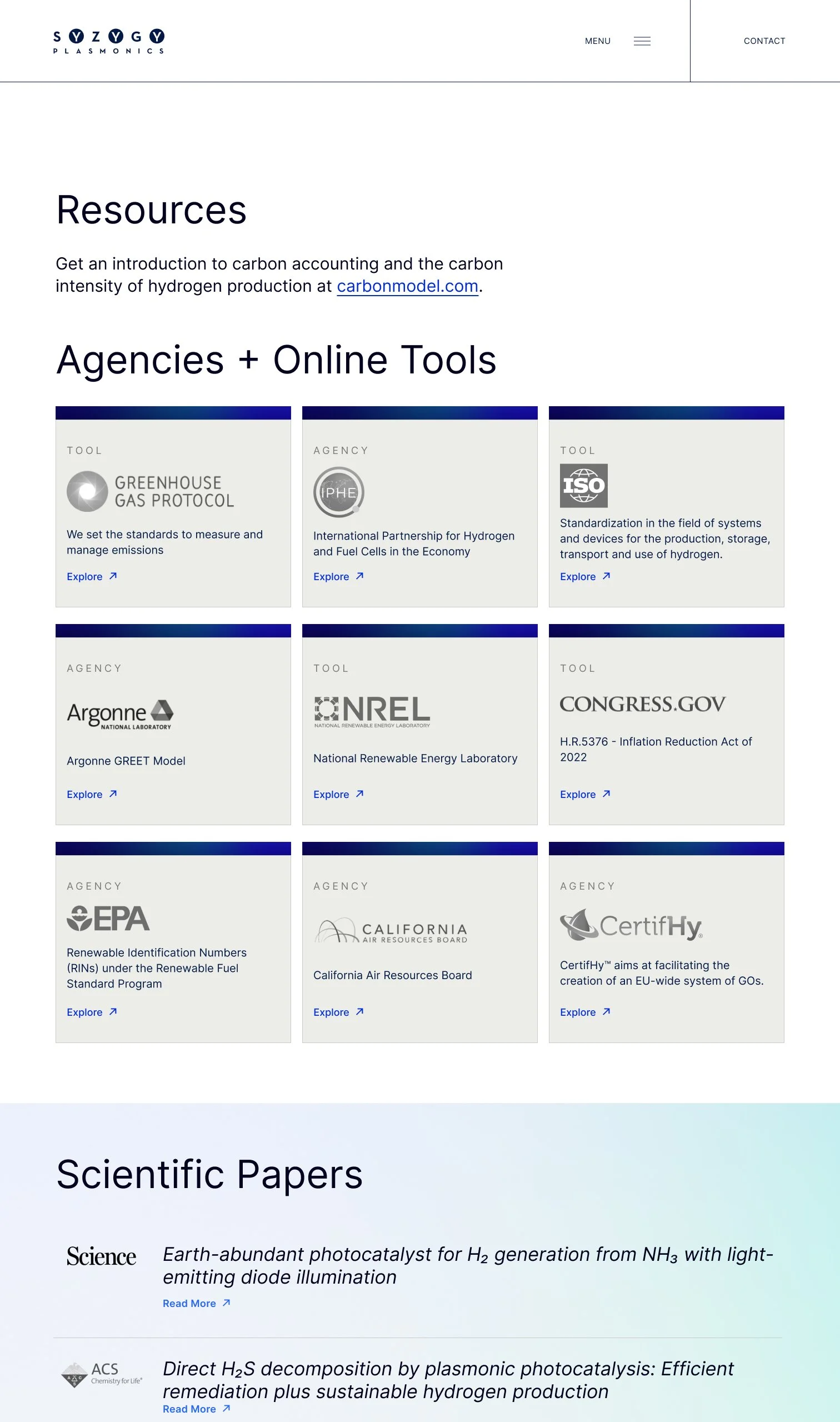
I particularly enjoyed using the softer brand gradient map in the background of the Resources page.