Client
_
Services
_
Brand Identity
Logo Design
Print Design
Web Design
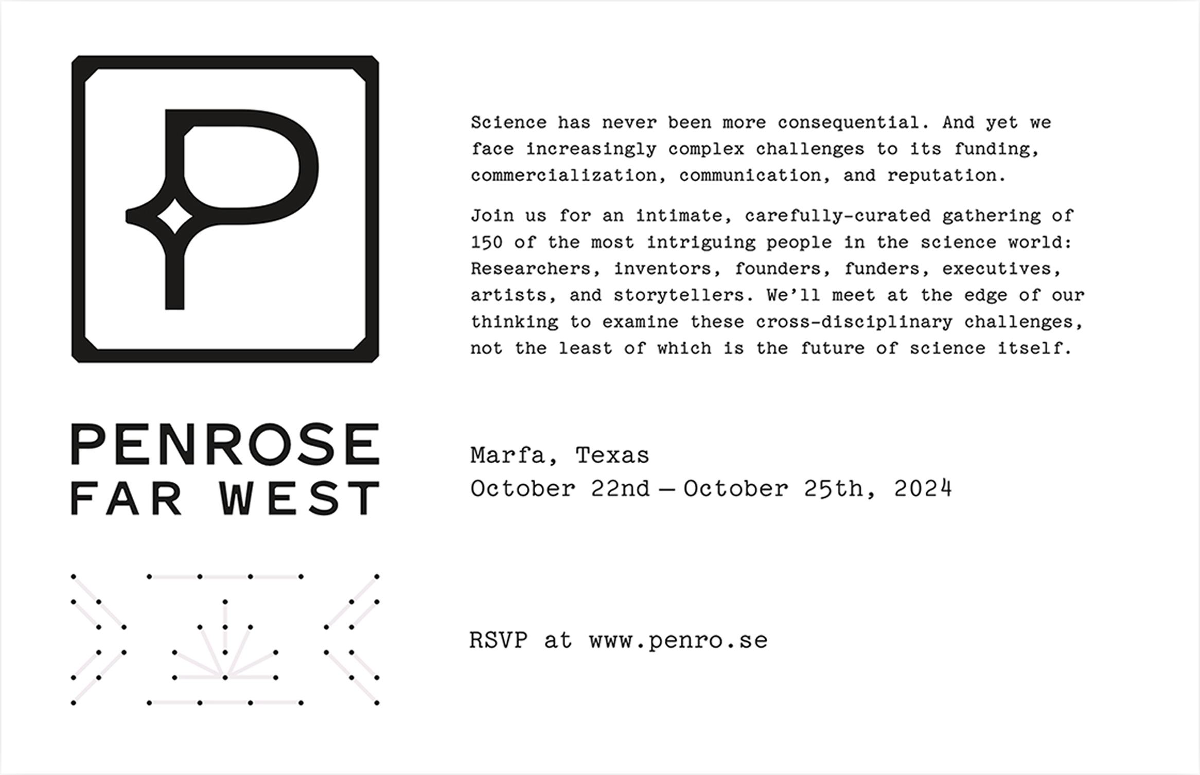
Penrose
Synopsis
_
Initiated and hosted by Austin marketing firm JDI, Penrose are intimate gatherings of the most intriguing people in the science world — researchers, inventors, founders, entrepreneurs, executives, artists, and storytellers.
As the lead designer I was in charge of crafting the event’s brand, with future annual gatherings and other kinds of events in mind. And the most important part for the inaugural year? An attention-grabbing physical invitation.
Direction was to keep the brand restrained and minimal, while still evoking themes of the event’s first location: Marfa in West Texas.
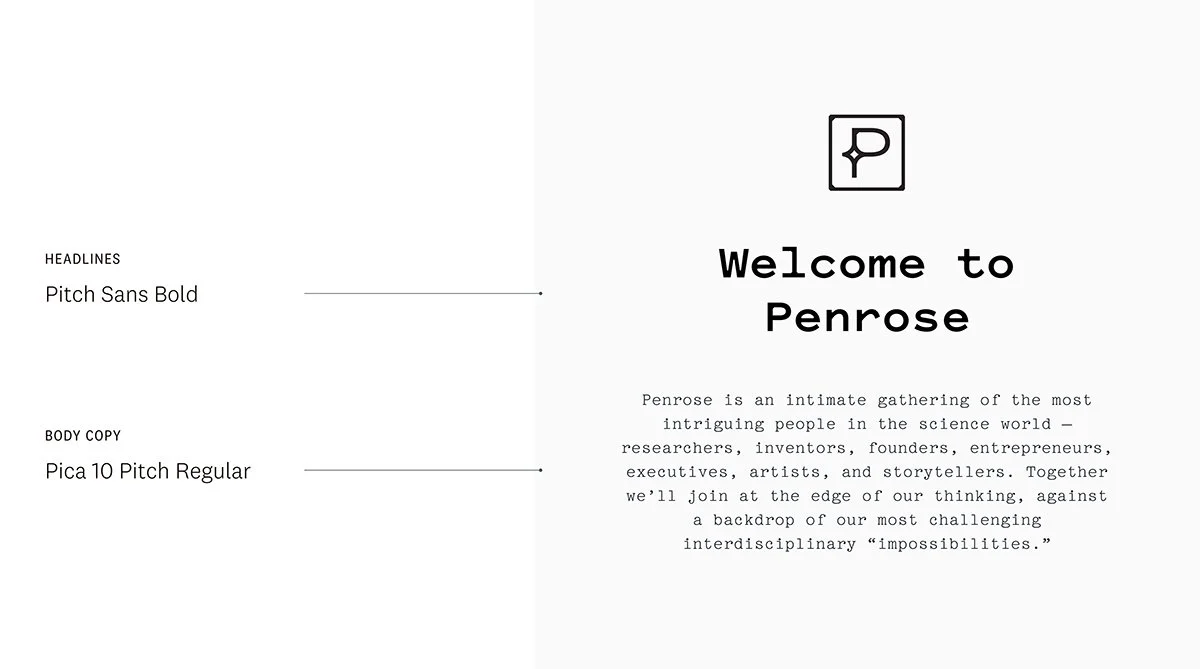
Logo + Brand
It’s always helpful when a designer can be privy to the naming process, as so much inspiration can be derived from other names and themes that are in consideration. Once the name had been decided, the event logo went through a couple iterations, with many stakeholders taking part.
The client loved the resulting logo, and it was also my frontrunner. They were also excited to use a brighter palette, inspired by the often overlooked colors of the desert flora and fauna.
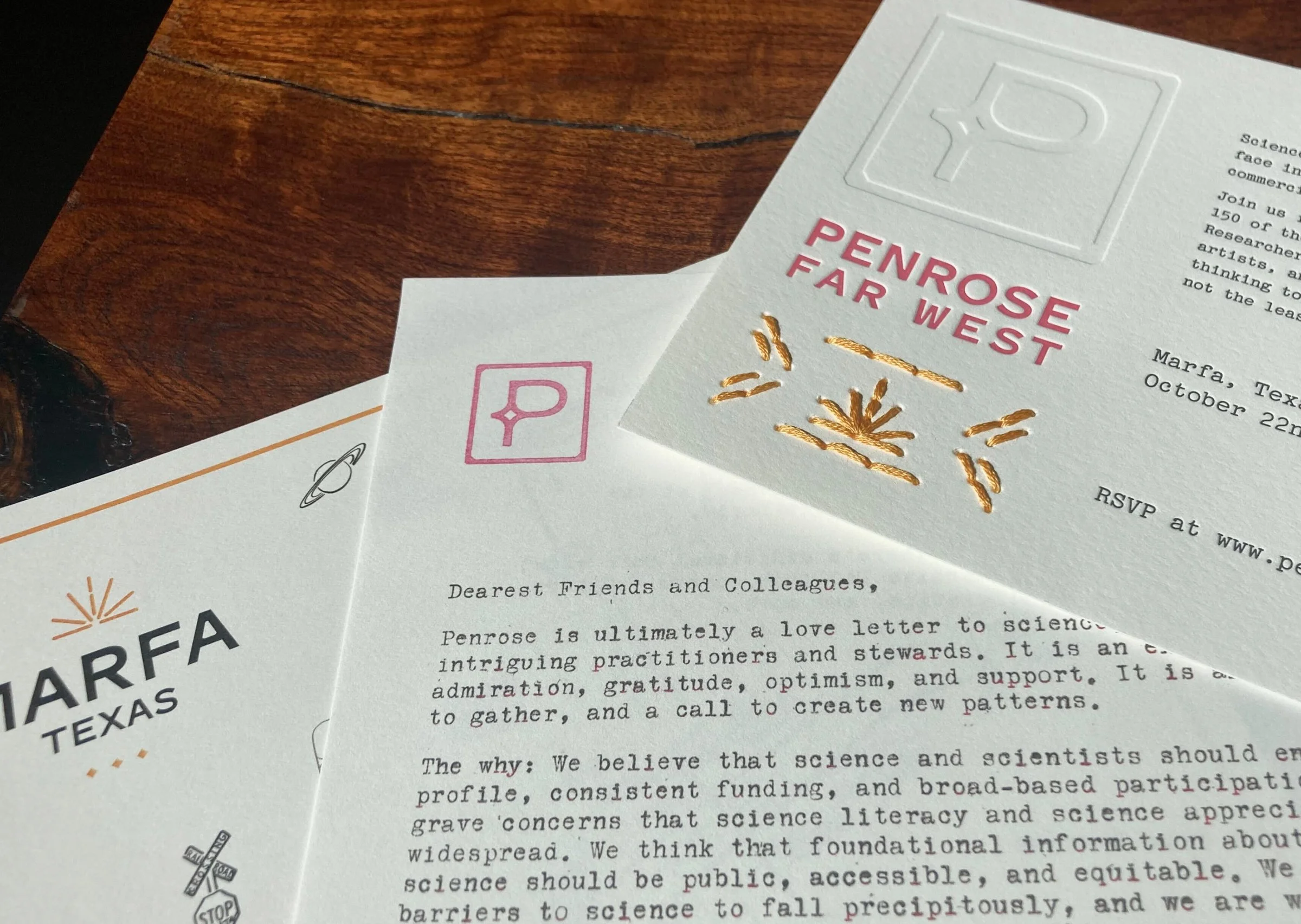
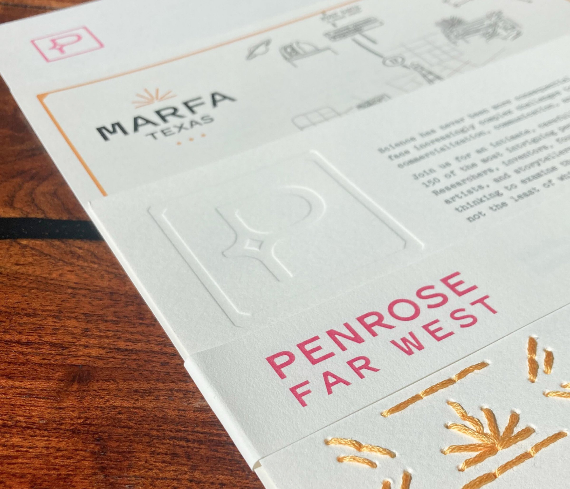
Invitation 2024
The invitation pack comprised four pieces: the embroidered invite, a typewritten letter from JDI’s CEO (with a hand-stamped Penrose logo at the top left), an illustrated map of Marfa, and a simple bellyband to hold it all together. Once stacked, the wordmark on the belly band exactly covers the debossed wordmark on the invitation, so only one is visible.
Over 300 invitations were produced and mailed to hand-selected invitees.
Map illustration and typewriting by Shanna Gerlach.
Invitation: Process
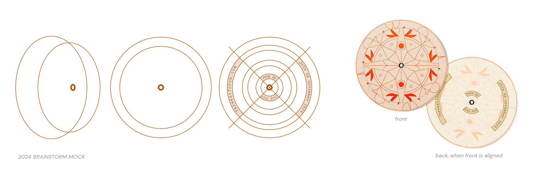
In addition to the chosen embroidery concept, I had pitched two additional ideas: One would use semi-transparent vellum for a layering effect, and the other would use an eyelet for some type of twist-hide-reveal interactive experience.
I mocked up something fairly simple to communicate the three directions, but the embroidery idea was the early favorite. Mixing unexpected mediums has always interested me, so I was thrilled.
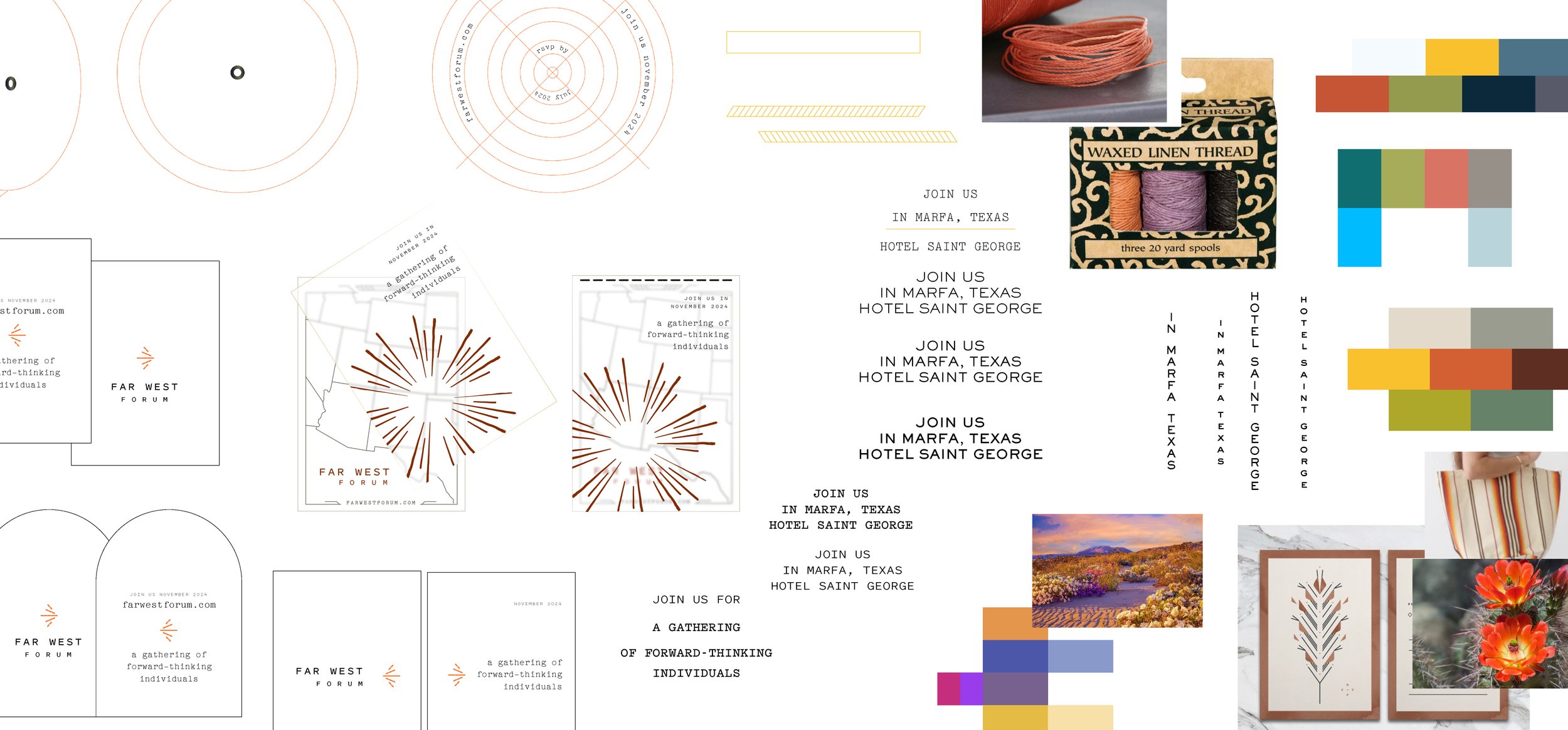
Invitation: Embroidery
Thanks to an Austin Chronicle article from 2021, I discovered local artist and embroiderist Erin Guevara-Inman. Erin had past experience embroidering paper specifically, so she helped us choose the appropriate paper weight that would hold up to thread, and additionally letterpress well.
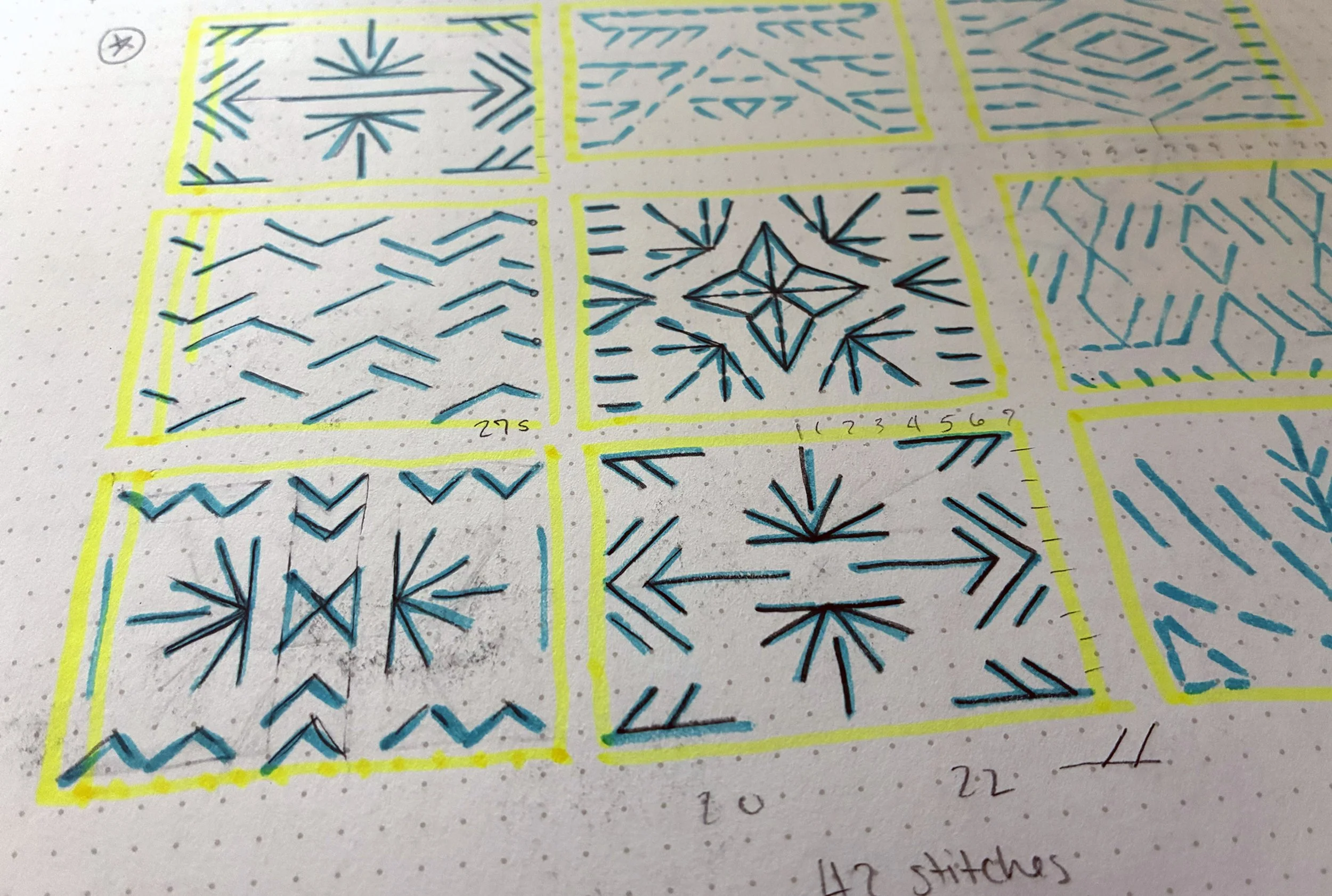
The embroidery spot illustration needed the right balance: something realistic within our time constraints and budget, and was also an appropriate nod to the event’s setting (without being appropriative). My dot matrix sketchbook was very helpful in iterating on the embroidery template.
The letterpress was done by Alisa Marrow of Percolator Press. We made sure to include a blind-pressed dot matrix to make the embroidery matrix clear.
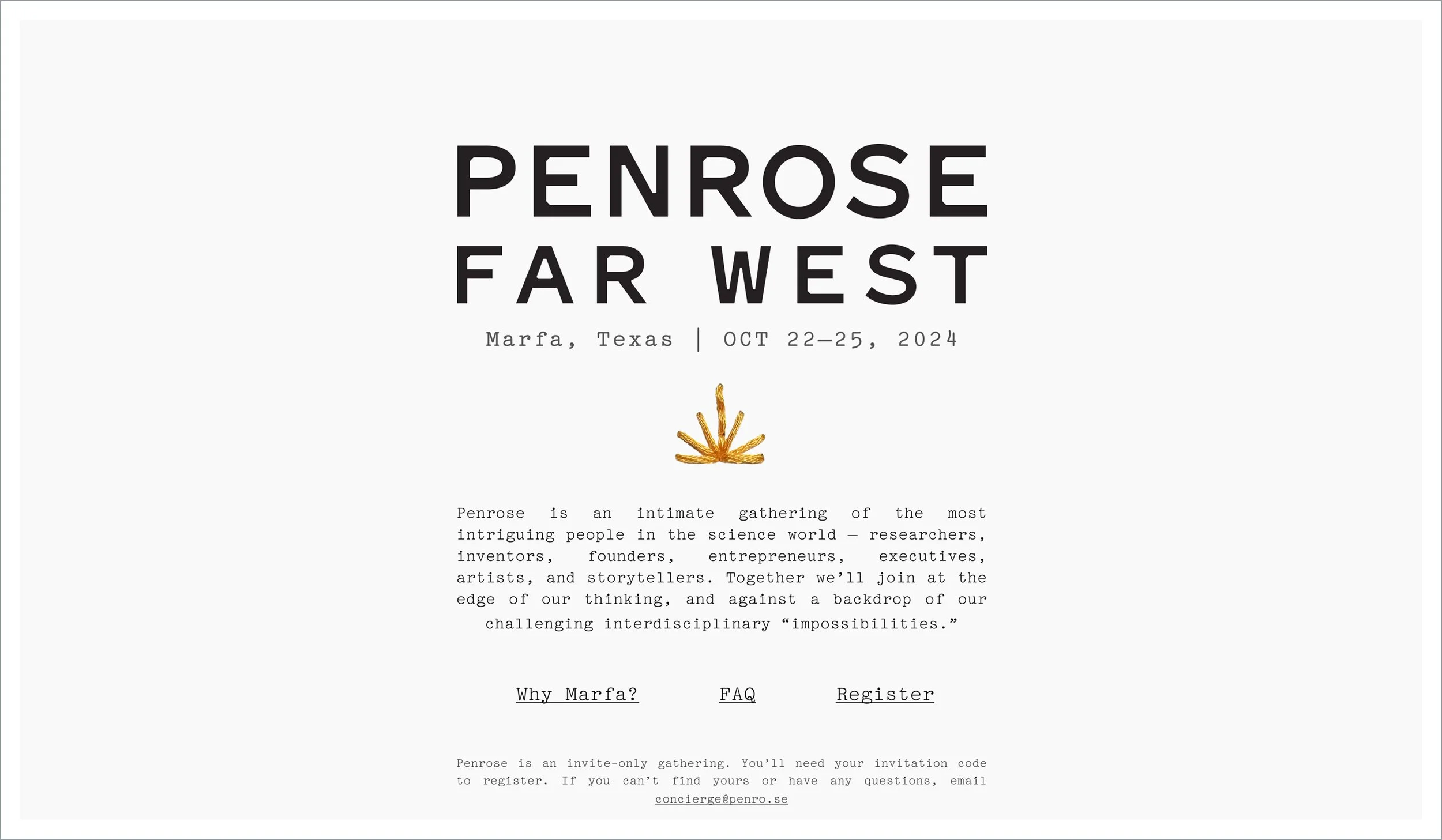
Website
The website was likewise minimal, using an isolated piece of embroidery from the invitation. My colleague Talia Bromberg designed the interior pages, which incorporated color from the brand’s extended palette.
The website evolved as the event approached, including more information about the talks and extracurriculars, and after the event a opt-in password-protected attendee directory to help with networking.
Event 2024
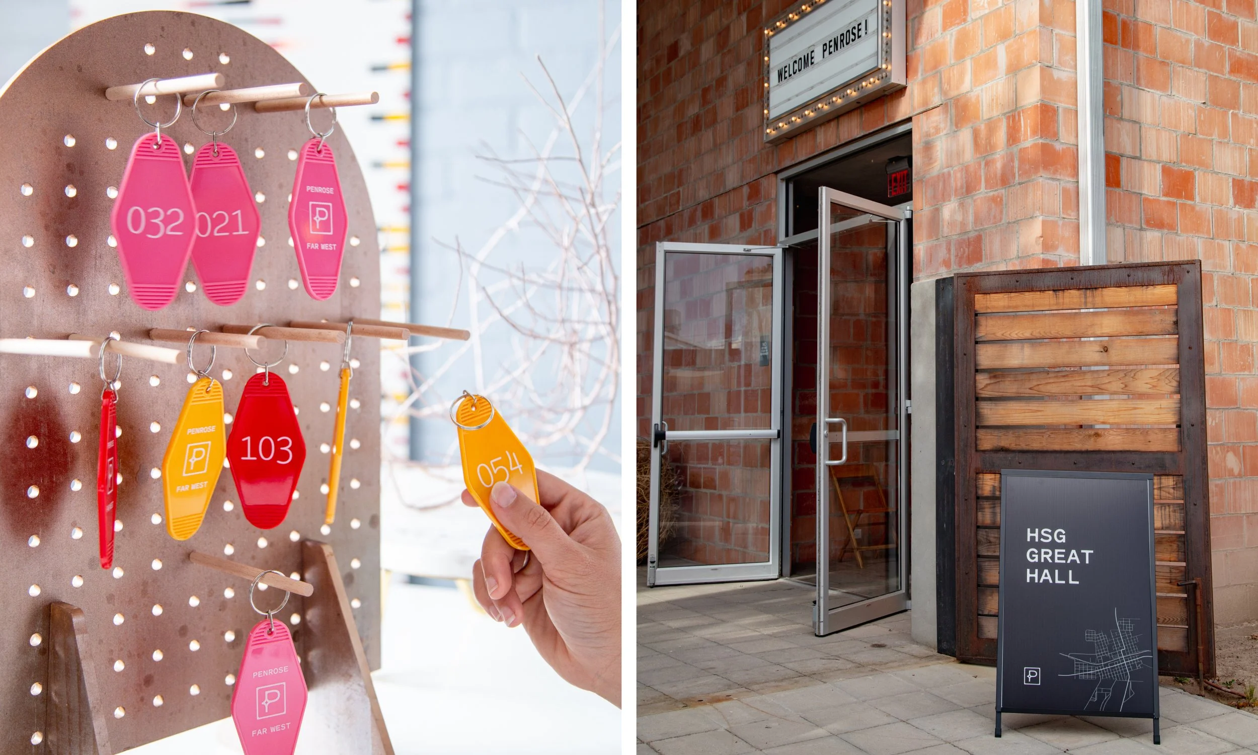
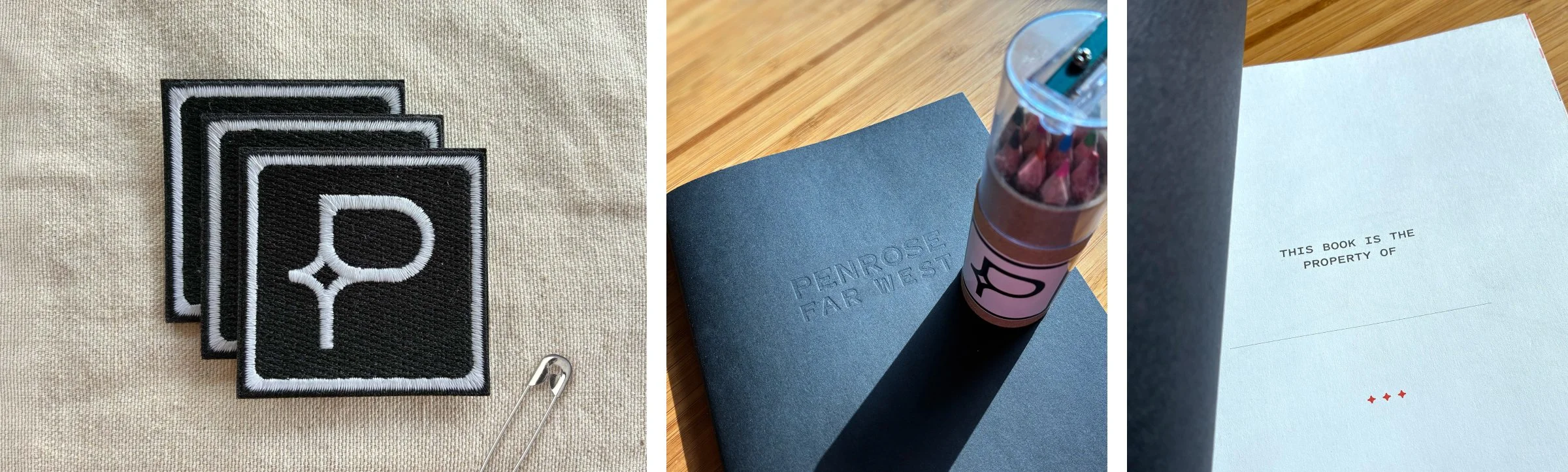
The event’s home base was the Hotel St. George in Marfa, Texas. As attendees checked in they were greeted with swag, including a colorful scarf from local business (Garza Marfa) branded with a subtle Penrose logo patch. Event photography by Shanna Gerlach.

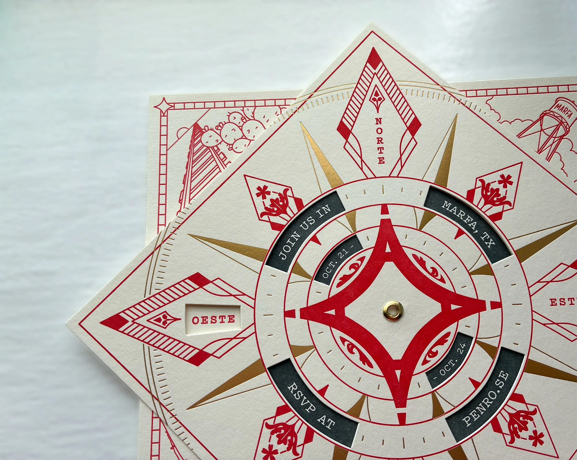
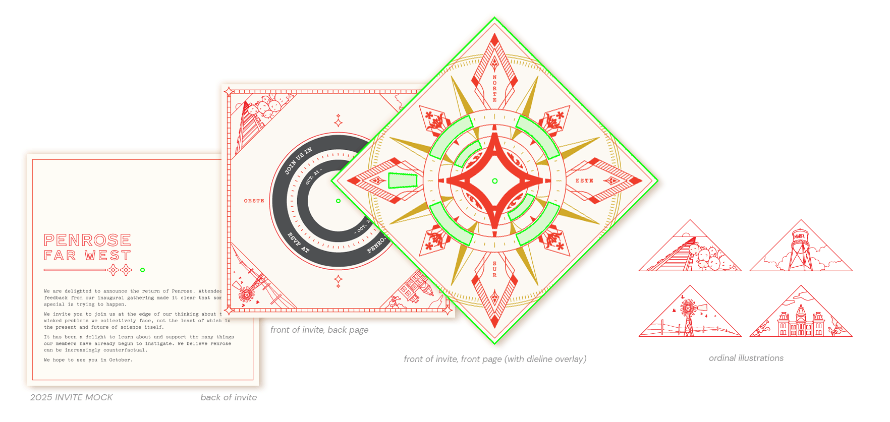
Invitation 2025
For 2025’s invite I was excited to use a concept from the previous year’s brainstorm: An interactive invite, revealing information once rotated a certain way. It was time for letterpress AND gold foil!
Invitation: Process
Almost everything changed from the originally proposed concept from 2024. The overall shape changed to a square to echo the Penrose logo shape. Once turned 45-degrees, two squares make the perfect shape for an 8-point compass rose.
It then made perfect sense to use the four-pointed star from the brand as the centerpiece. I also put the design and the text windows on the same side of the invitation, rather than the windows on the back, so it was easier to see content in the windows during rotation. We then had space for more copy on the back of the compass.
I again wanted references to the event’s setting embedded within the design. I worked with my colleague Shanna Gerlach to determine the Marfa-themed ordinal (corner) illustrations, and the floral filagree is a West Texas native flower called the Davis Mountain Mock Vervain.
Invitation: Final Package
To attach the pieces of paper at the axis of rotation, we manually hammered a brass eyelet through the center of both. The eyelet allowed for just the right amount of friction between the layers when spun. The missing “oeste” (“east” in Spanish) fills the gap only when turned to the correct orientation, which also reveals the event details.
Shanna Gerlach illustrated, designed, and laid out the combination of map and letter (again written by JDI CEO Josh Jones-Dilworth), with me doing a final pass towards the end of the process. We stacked this on top of the compass rose, and placed both within a semi-opaque wax paper envelope, taped shut with a piece of vertical Penrose-red washi tape.
Max Koch of Koch Printing in East Austin did the incredible letterpress work. I cannot recommend him enough!