Client
_
Services
_
Synopsis
_
Brand Identity
Infographics
UI Toolkit
Web Design
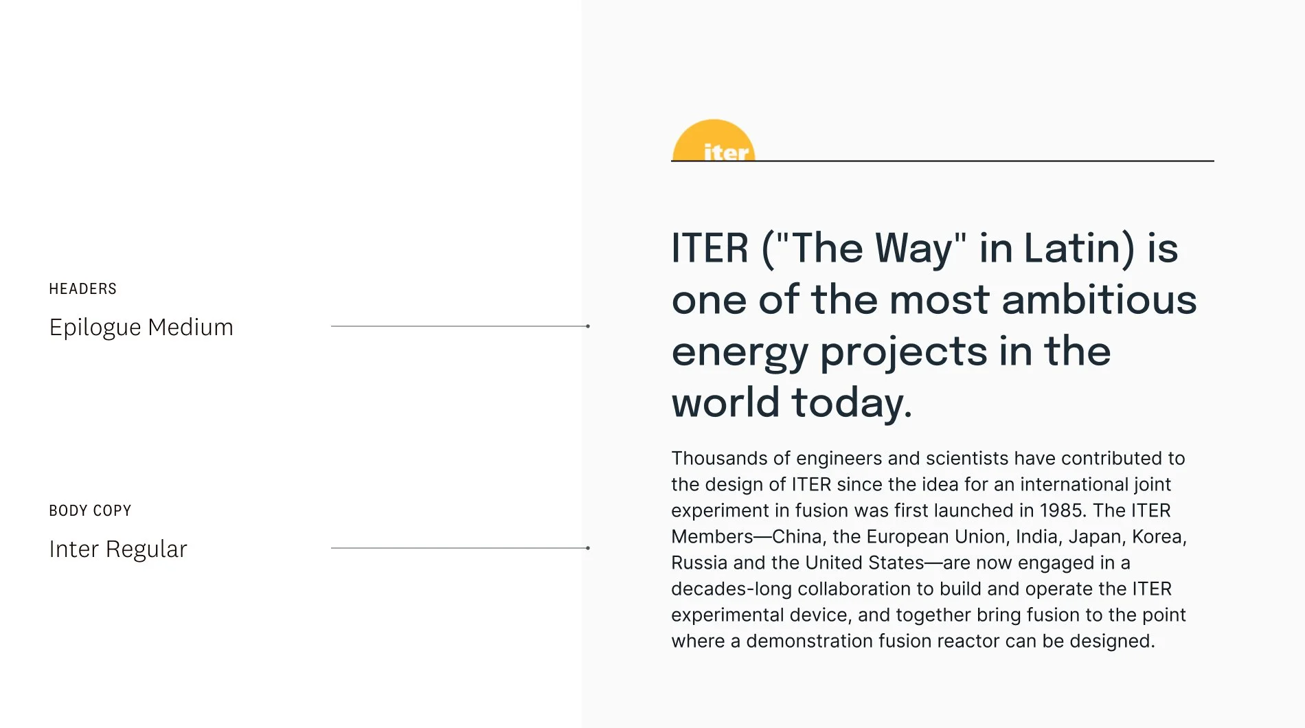
ITER
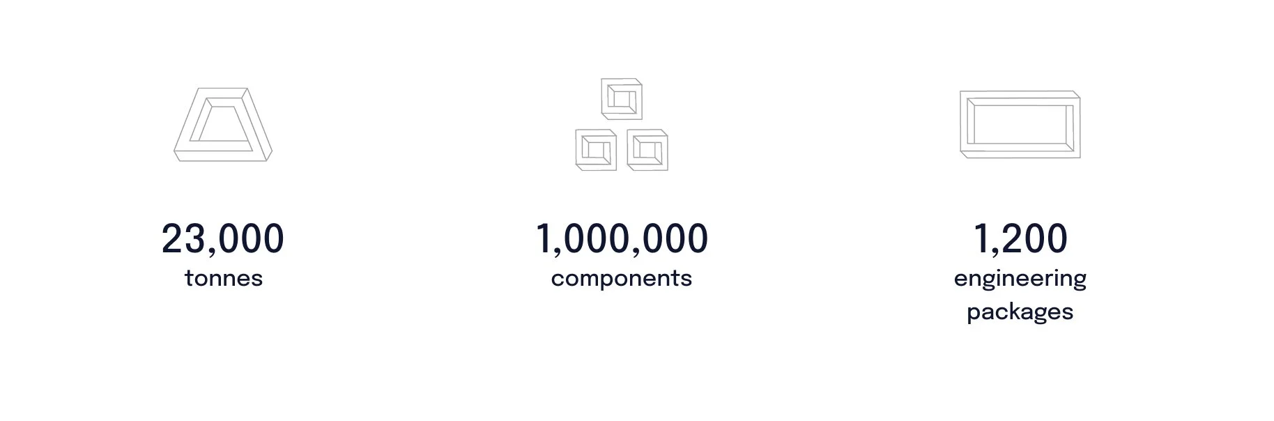
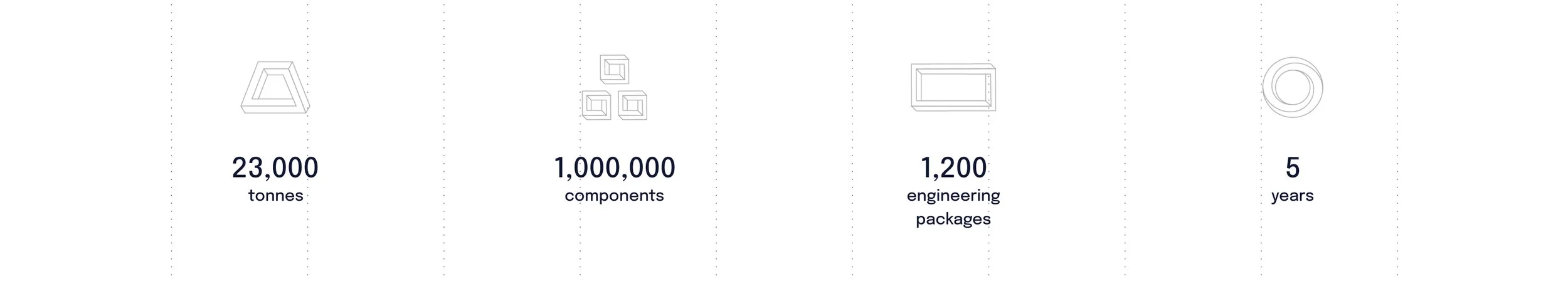
ITER is a large-scale, international scientific collaboration intended to prove the viability of fusion as an energy source. They are constructing a tokamak fusion device in southern France, with the goal of being online by 2035.
We worked with ITER to refresh their existing brand, and redesign their extensive, information-driven website.
ITER: Provided logo, video, photography, and renders
Brand
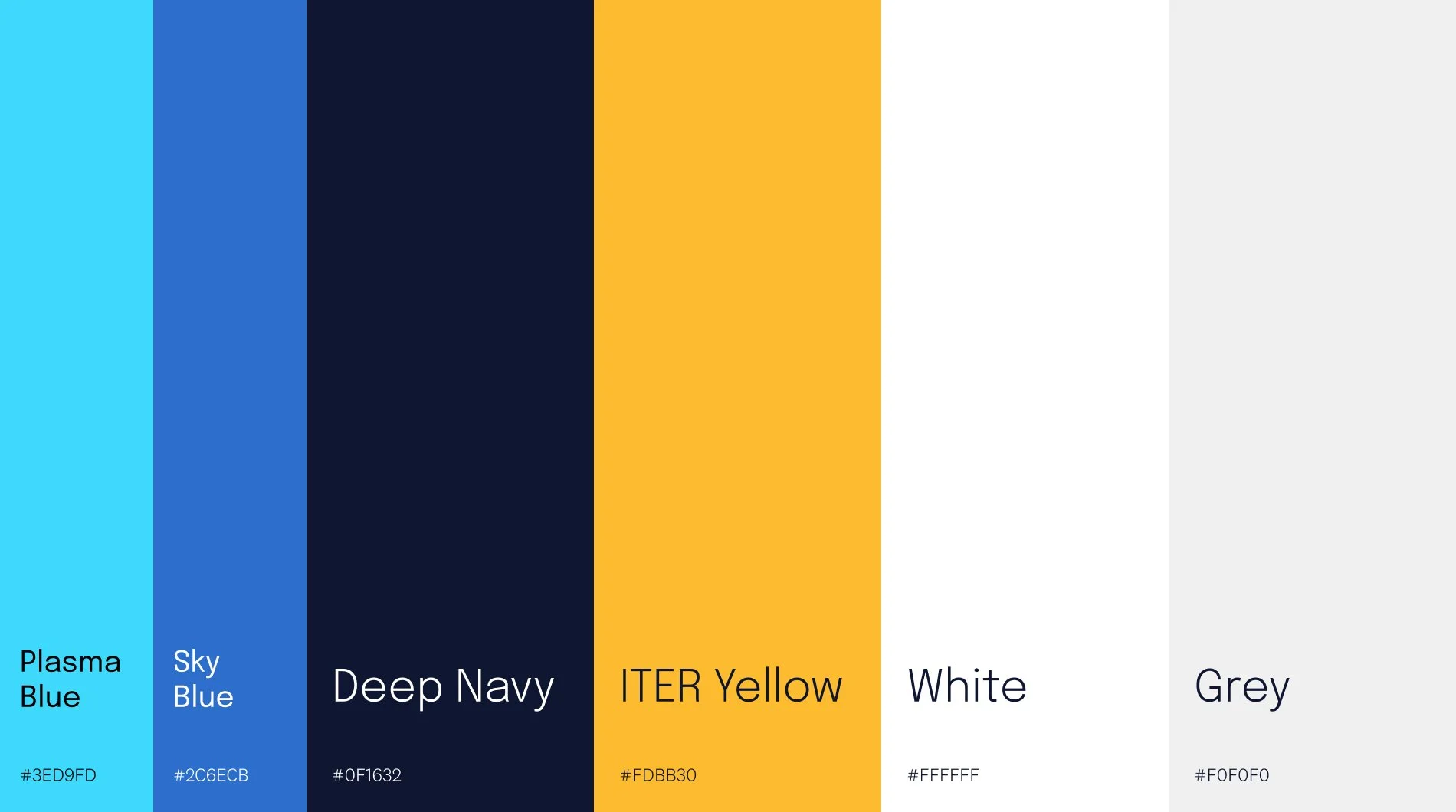
“Noon Yellow” was integral to ITER’s pre-existing brand, so all explored palettes began with this in mind.
This would be a website with a ton of written content, so the team paid special attention to the typography. Epilogue was chosen as the header typeface, a great modern serif with just enough character. And Inter was an obvious choice for highly-legible body copy.
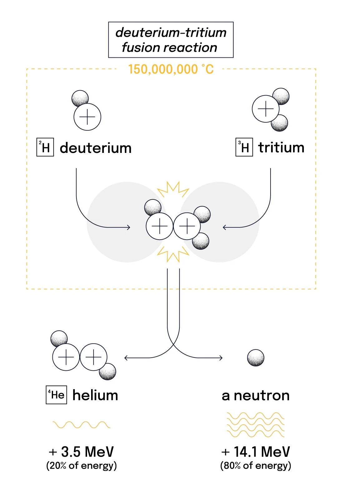
Illustration
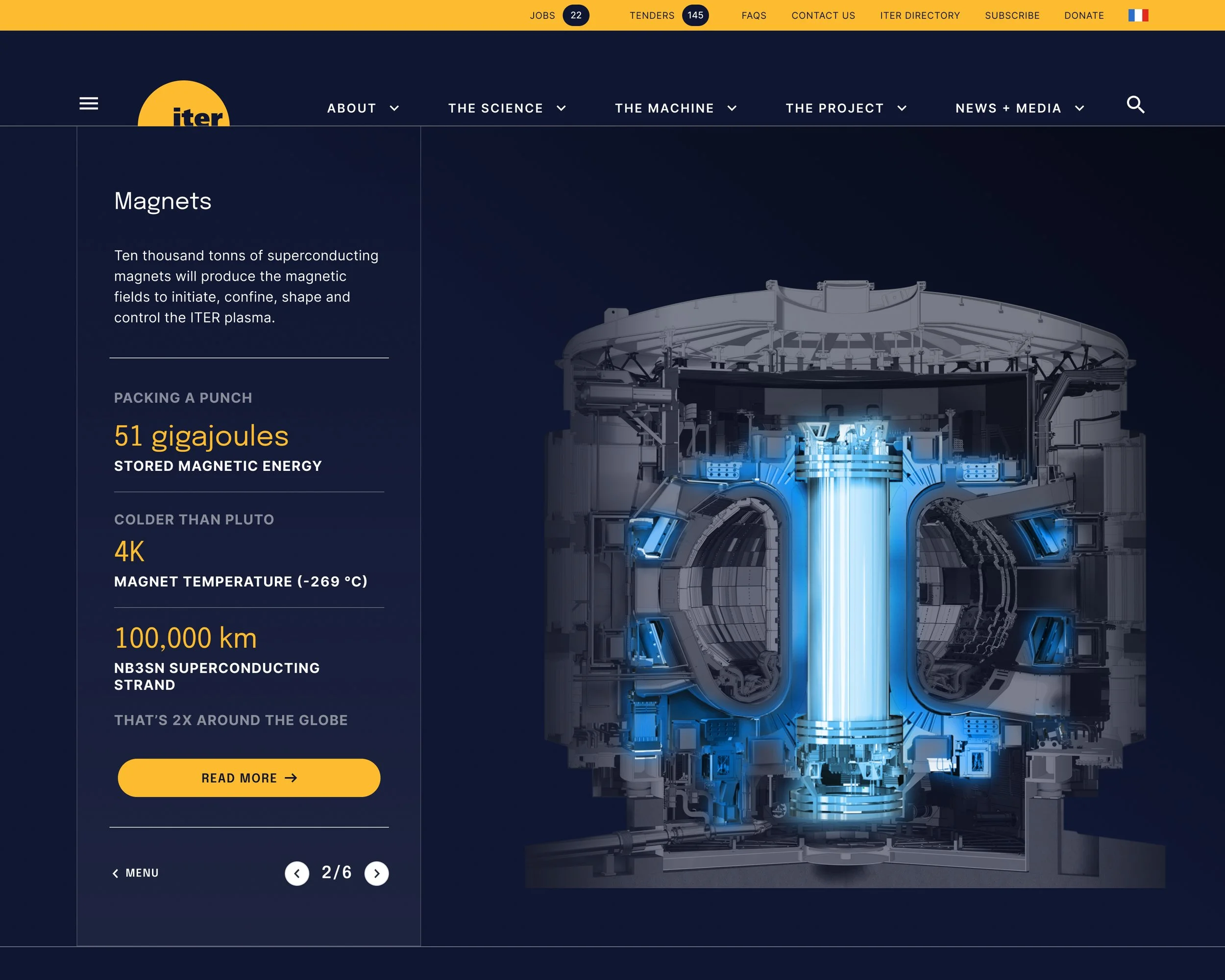
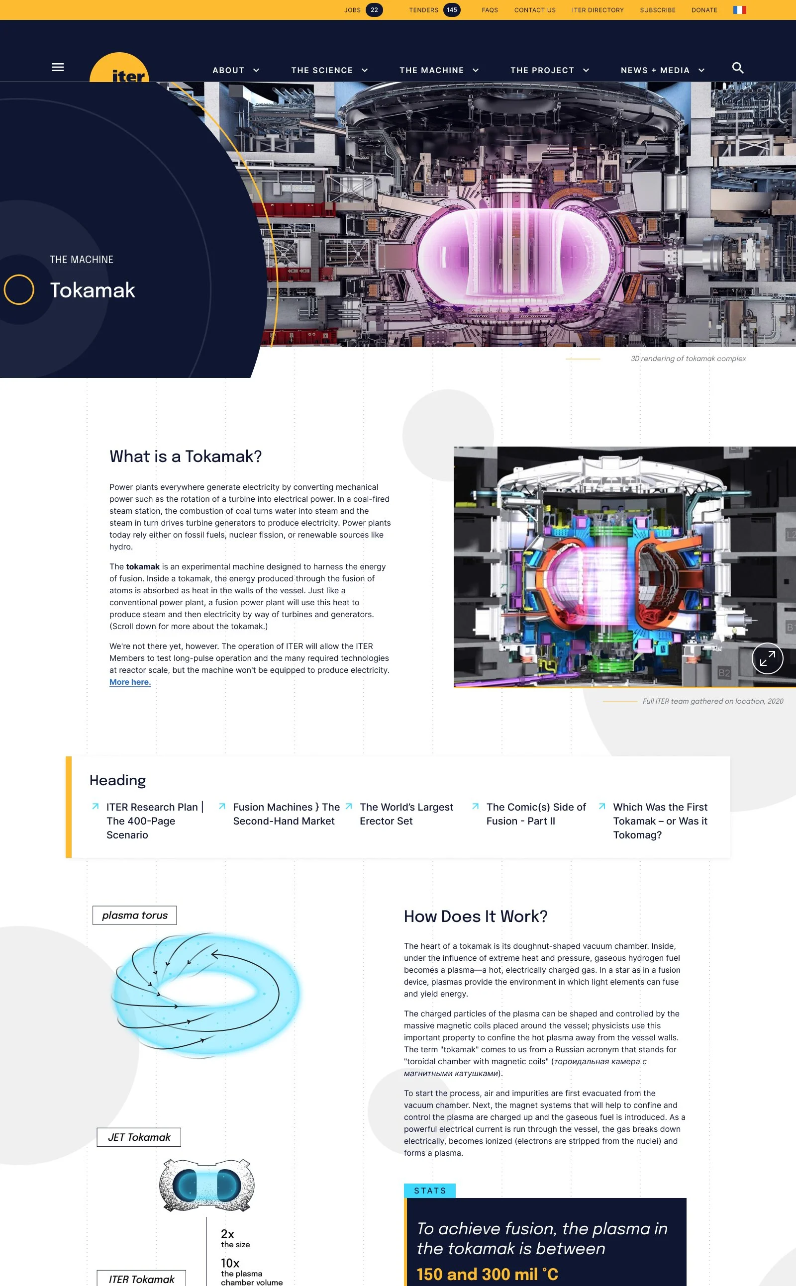
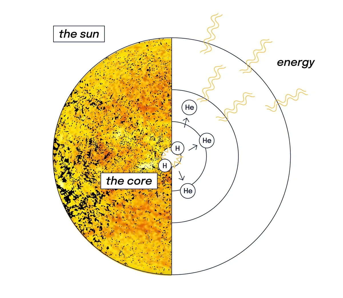
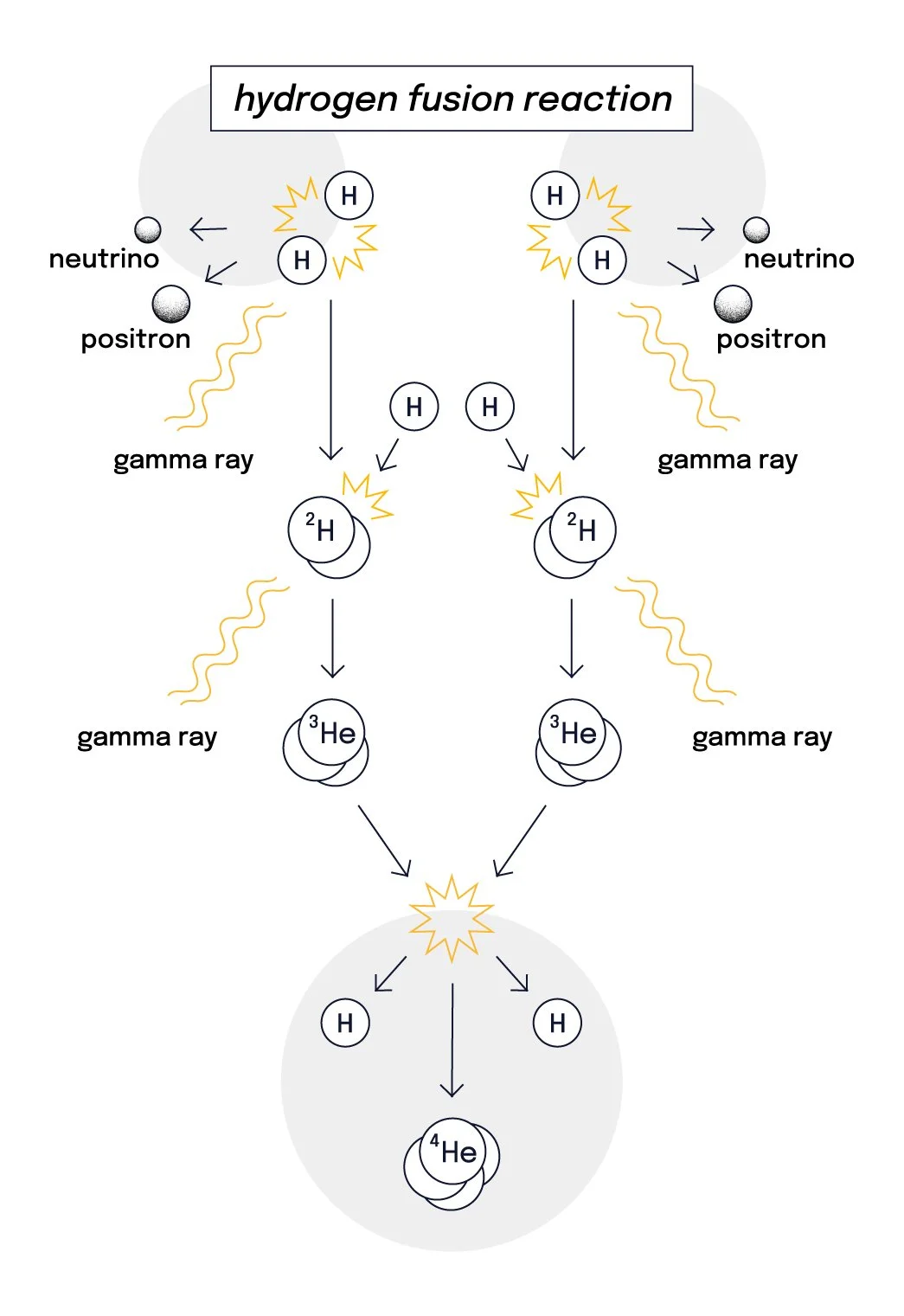
I created a small series of infographics and animations to help visualize an operational tokamak fusion device. Both scale and desired results (the molecular chain reaction) were explained.
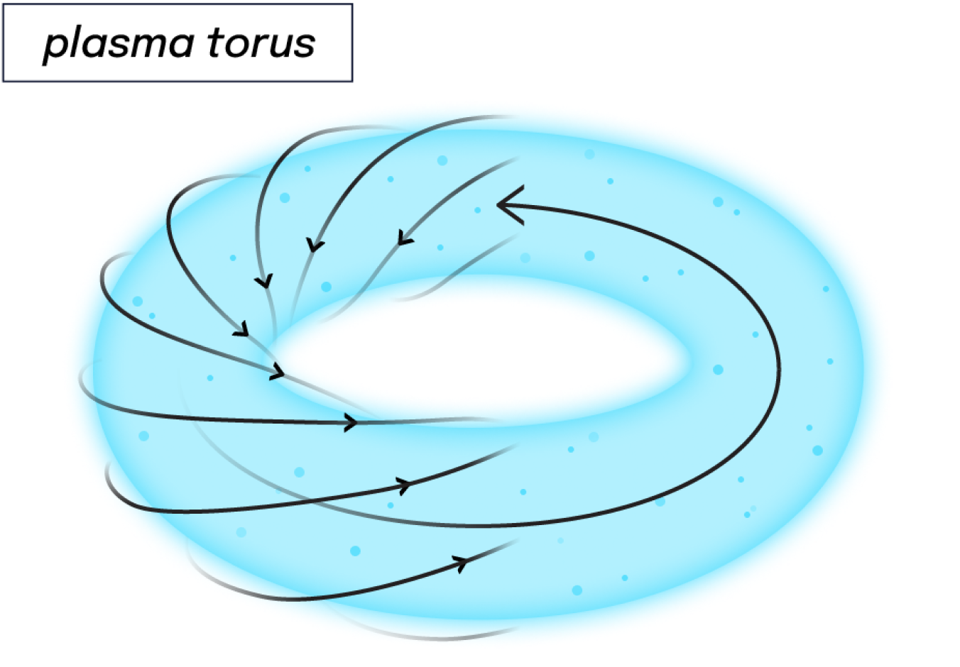
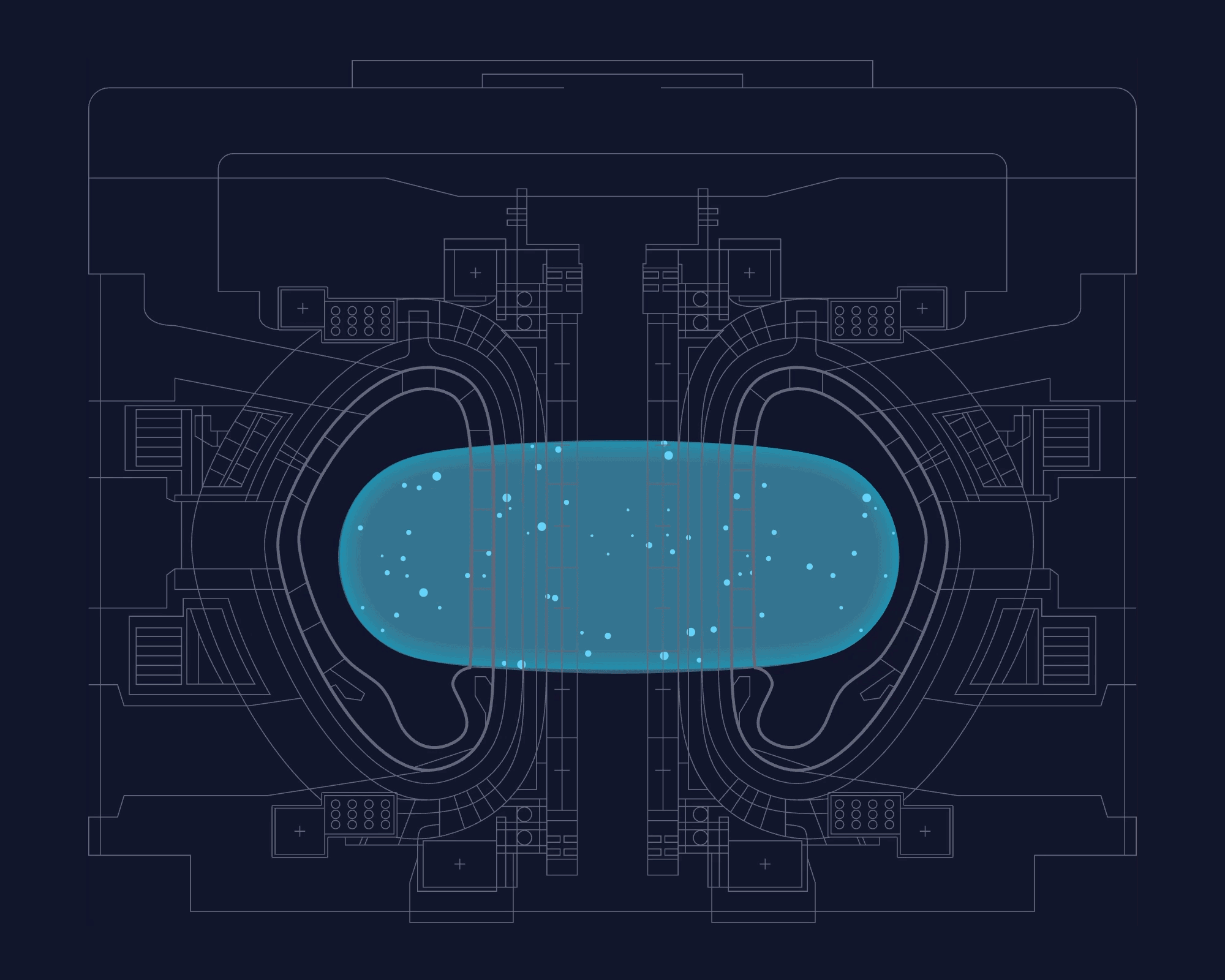
Impossible Shapes
I added impossible geometry as a reoccurring brand motif, inspired by the eternally twisting plasma torus created within an operational tokamak. I loved how the seeming impossibility of stable fusion is reflected in these mind-bending shapes.

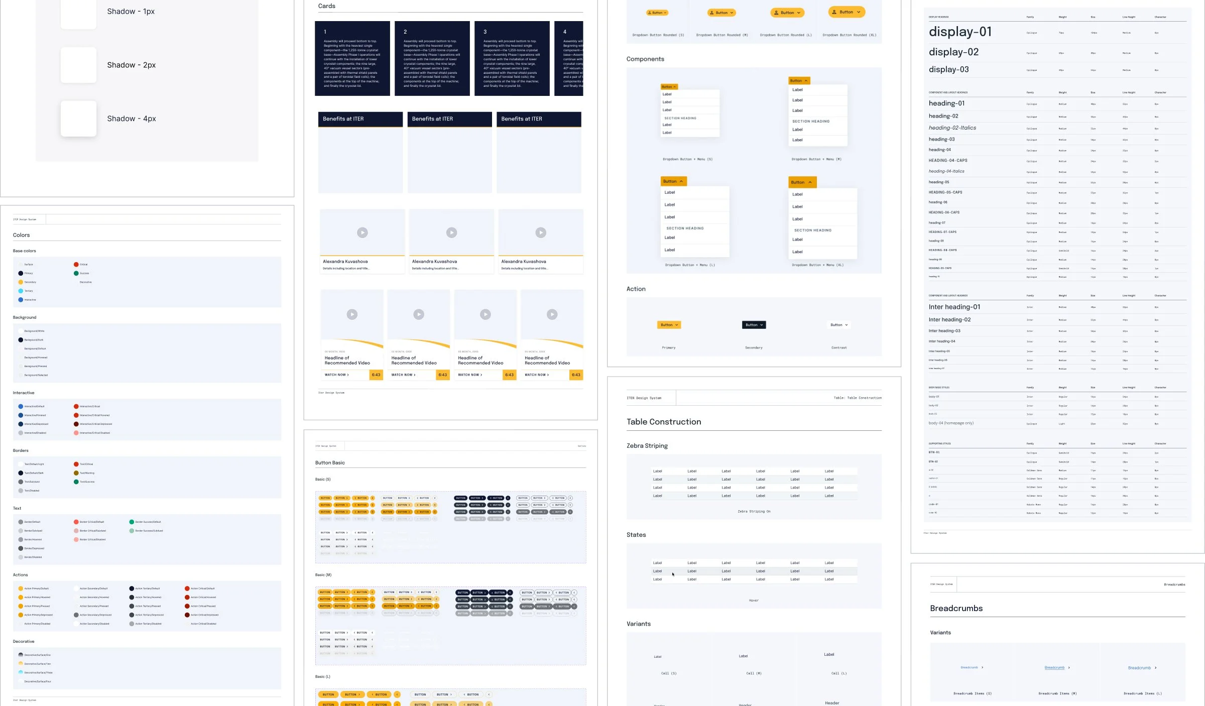
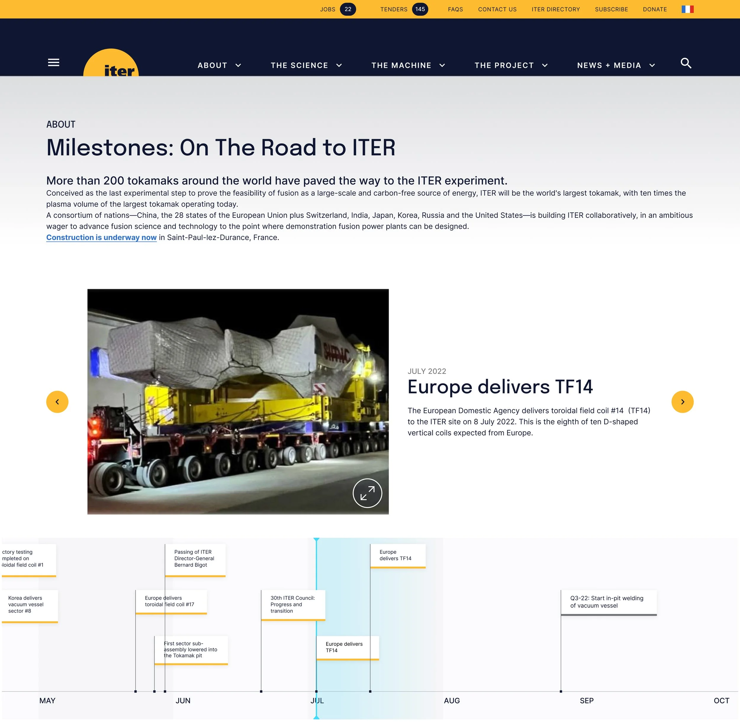
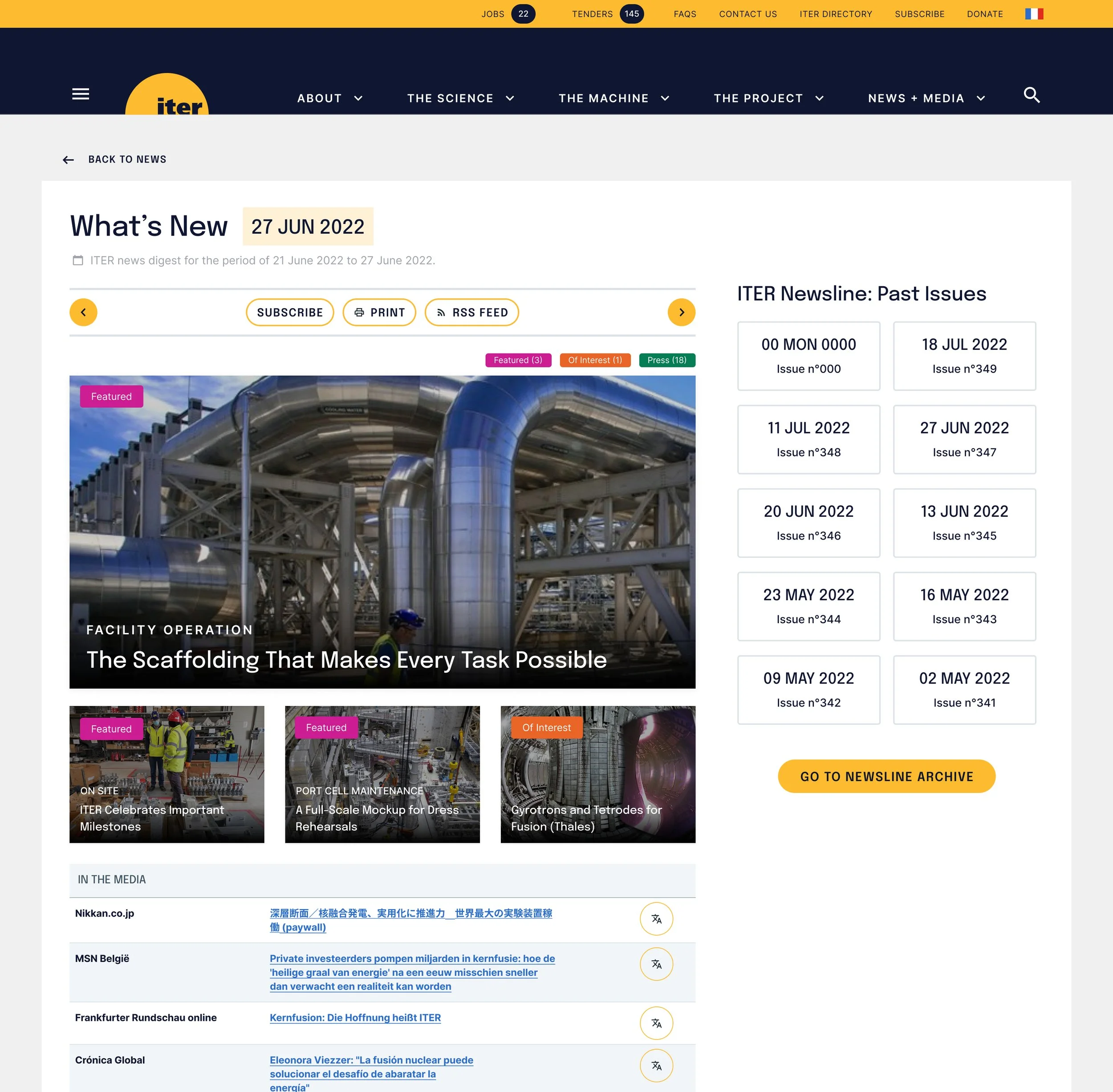
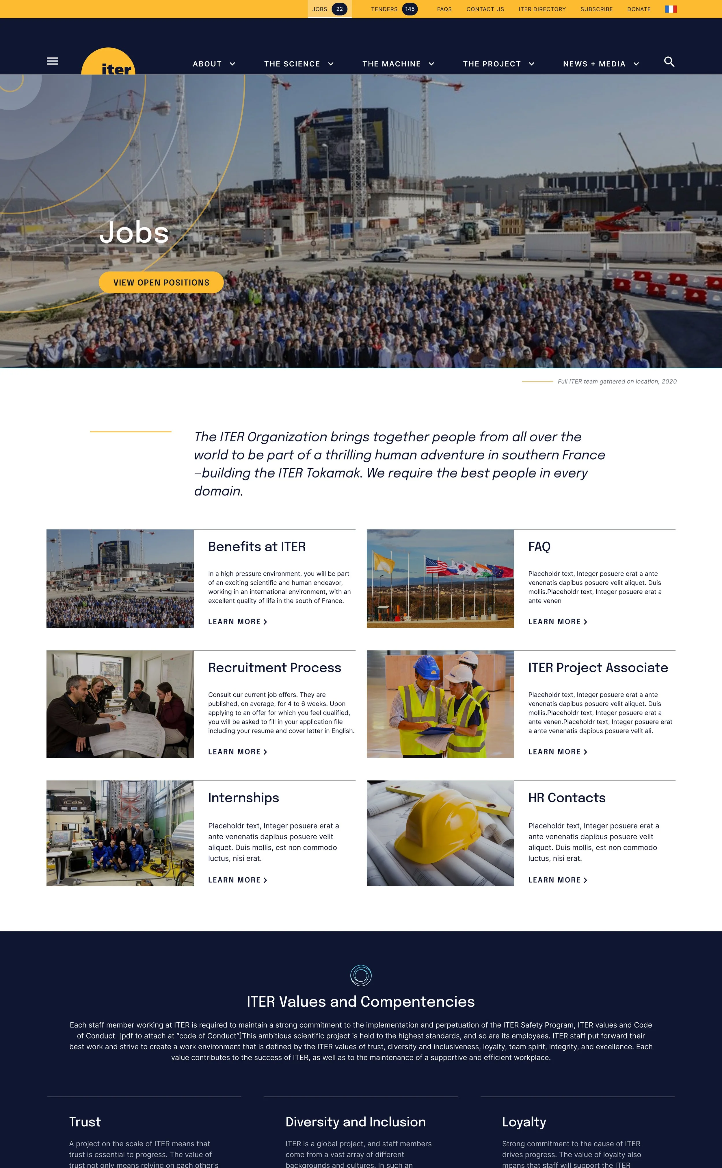
UI Toolkit + Website
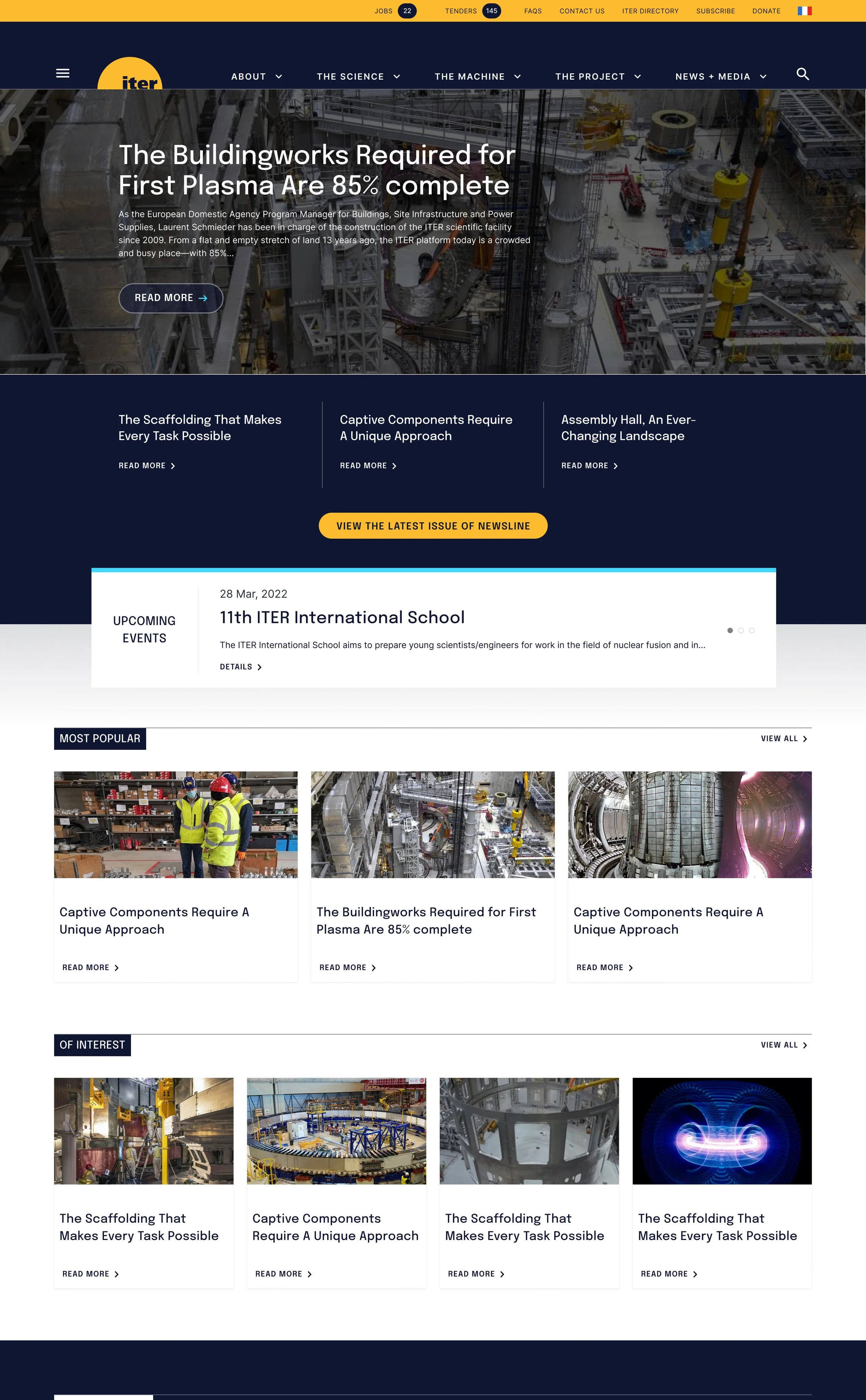
Due to budget constraints, Talia Bromberg and I designed only a dozen web pages of this easily 150+ page website. We first prioritized the most important (high traffic) pages, then the most unique pages. We made sure to represent each potential type of webpage.
Once those core pages were complete, Talia and I rounded out an extensive UI toolkit in Figma. This was for ITER’s development team to use while recreating the rest of the webpages.