Client
_
Services
_
Synopsis
_
Brand Identity
Iconography
Infographics
Photo Manipulation
Web Design
EMROD
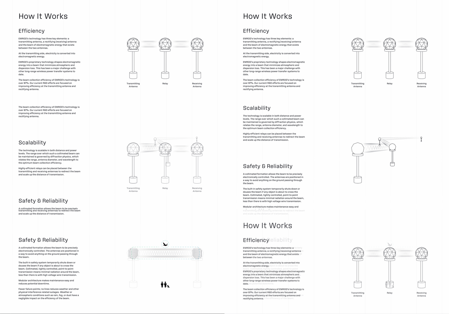
EMROD is creating the technology for commercially-viable long-range wireless power transfer. From deploying the first ever global energy grid in space, to bringing power to remote earthly locales, EMROD’s system would transmit large amounts of energy over long distances, no wires needed.
EMROD: Provided original logo and isolated relay tower renders
Rebecca Ewing: Creative Director
Brand
First thing: I advised a small tweak to the existing EMROD logo. We made the lightning bolt ever so slightly larger within the “O” to match the visual weight of the rest of the mark.
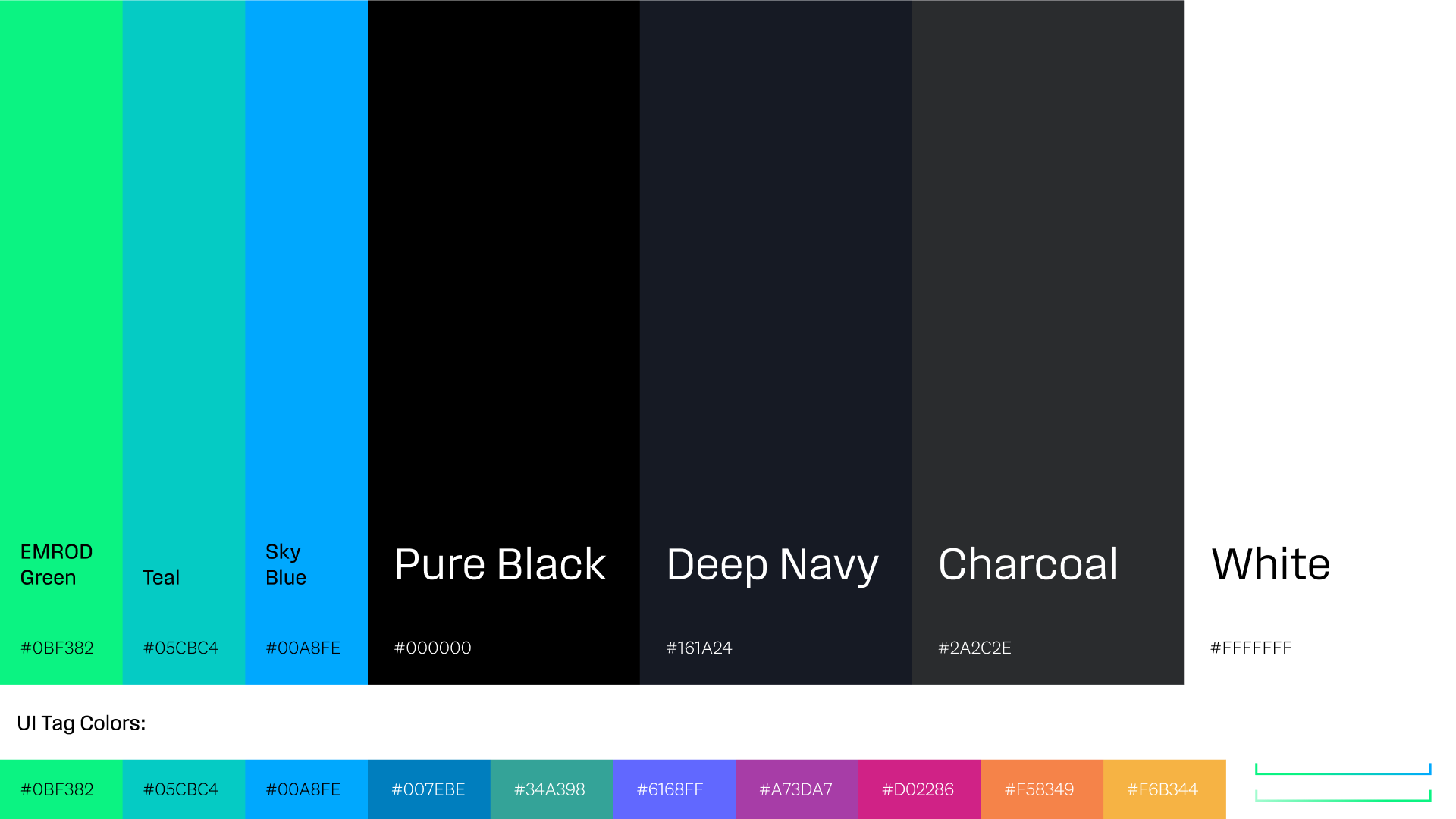
As detailed below, photography was to be the main source of color. The neon-brights shown below are used sparingly on the website and in collateral (many being screen-only).
Website
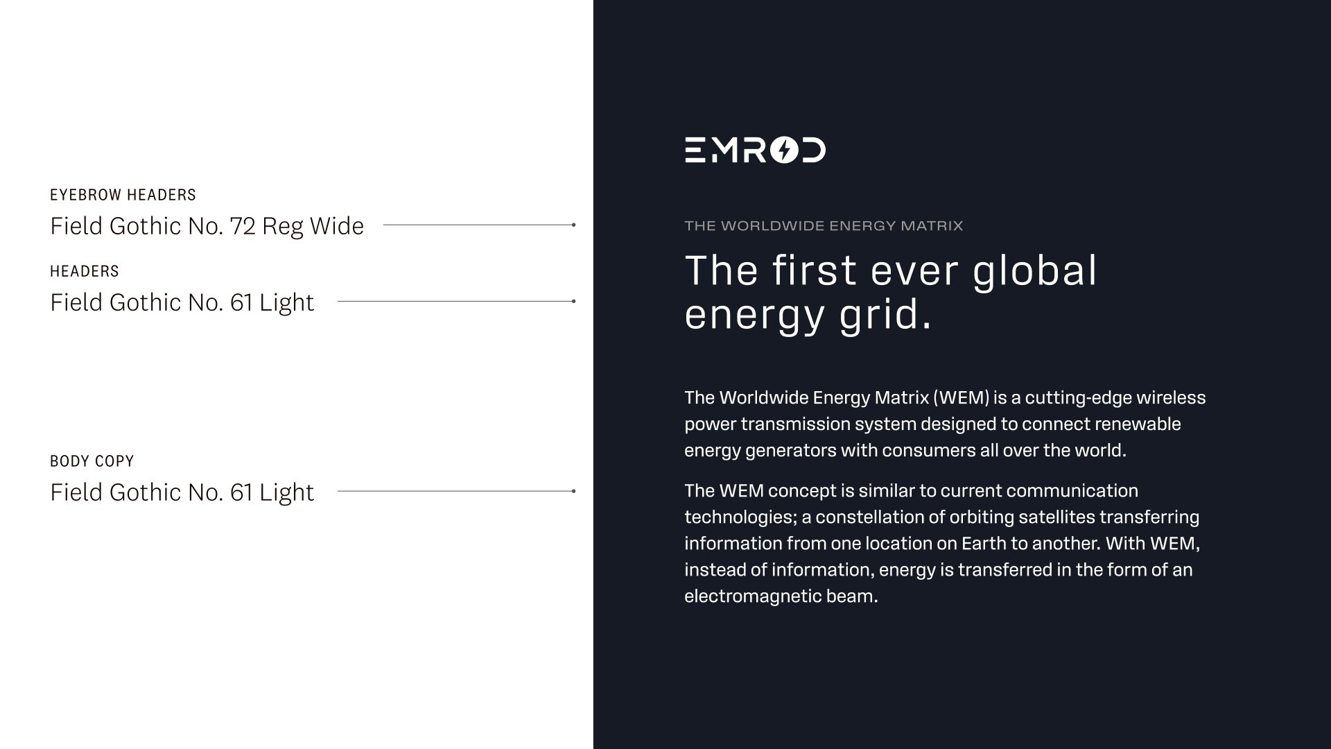
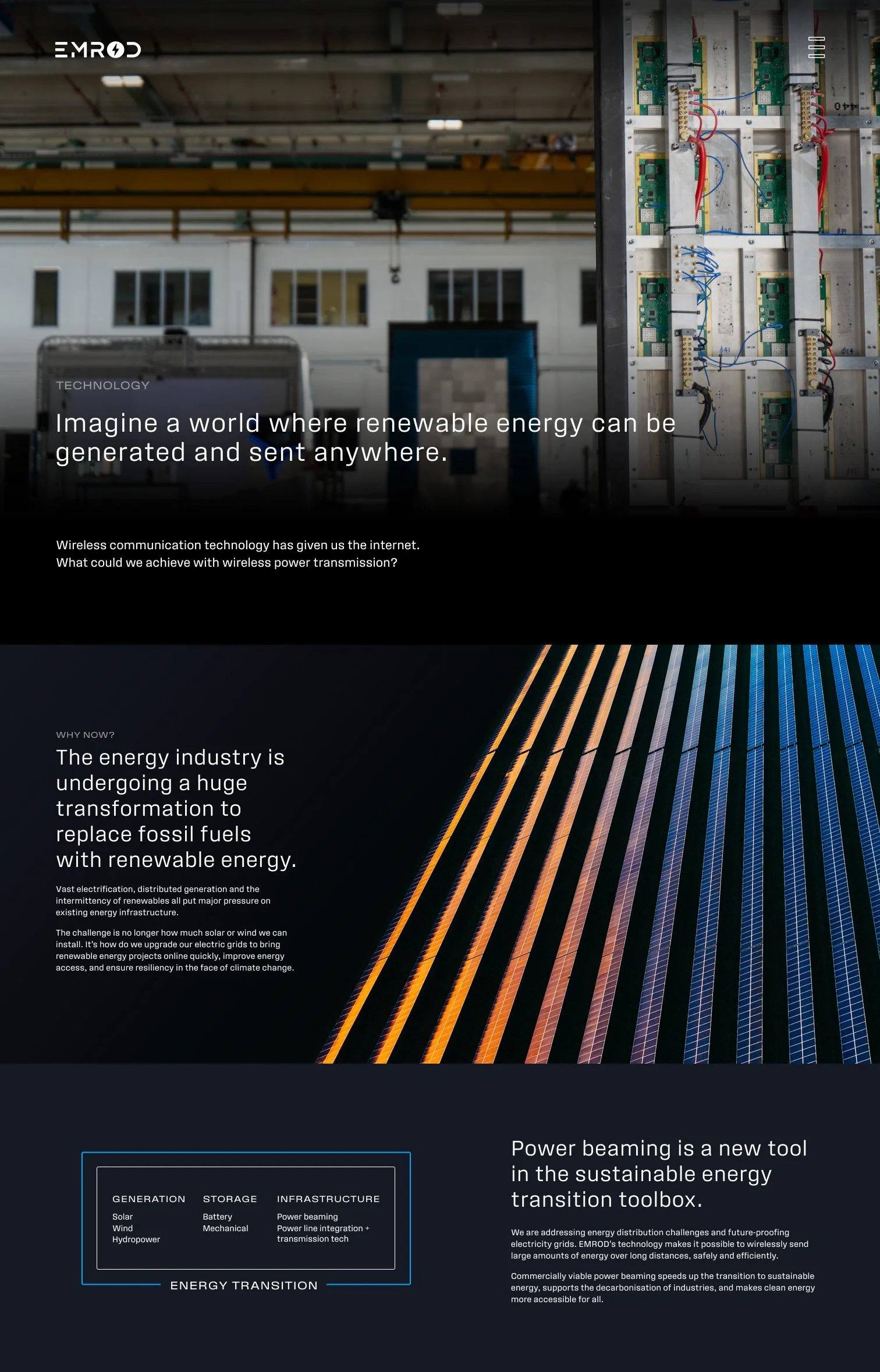
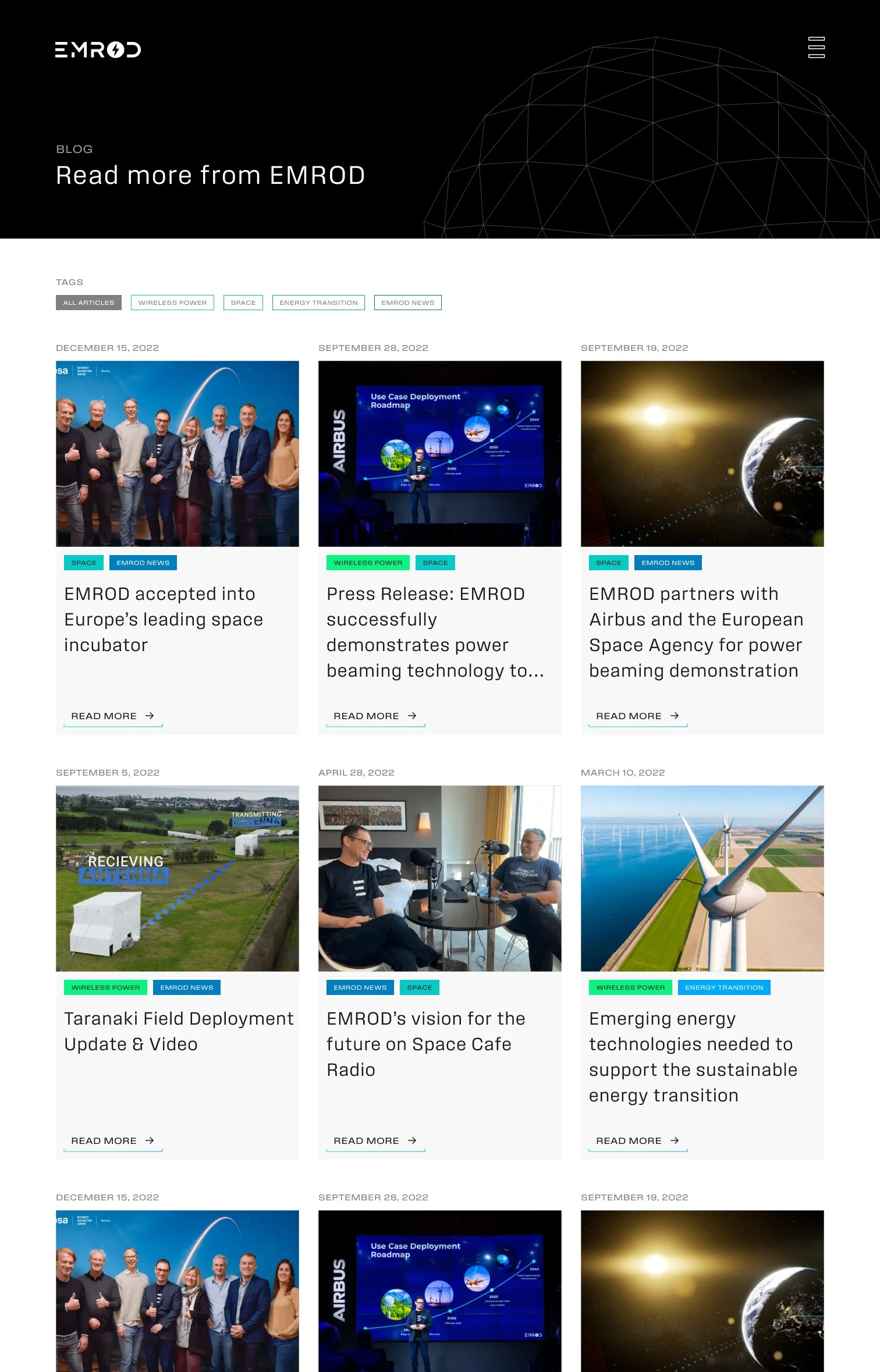
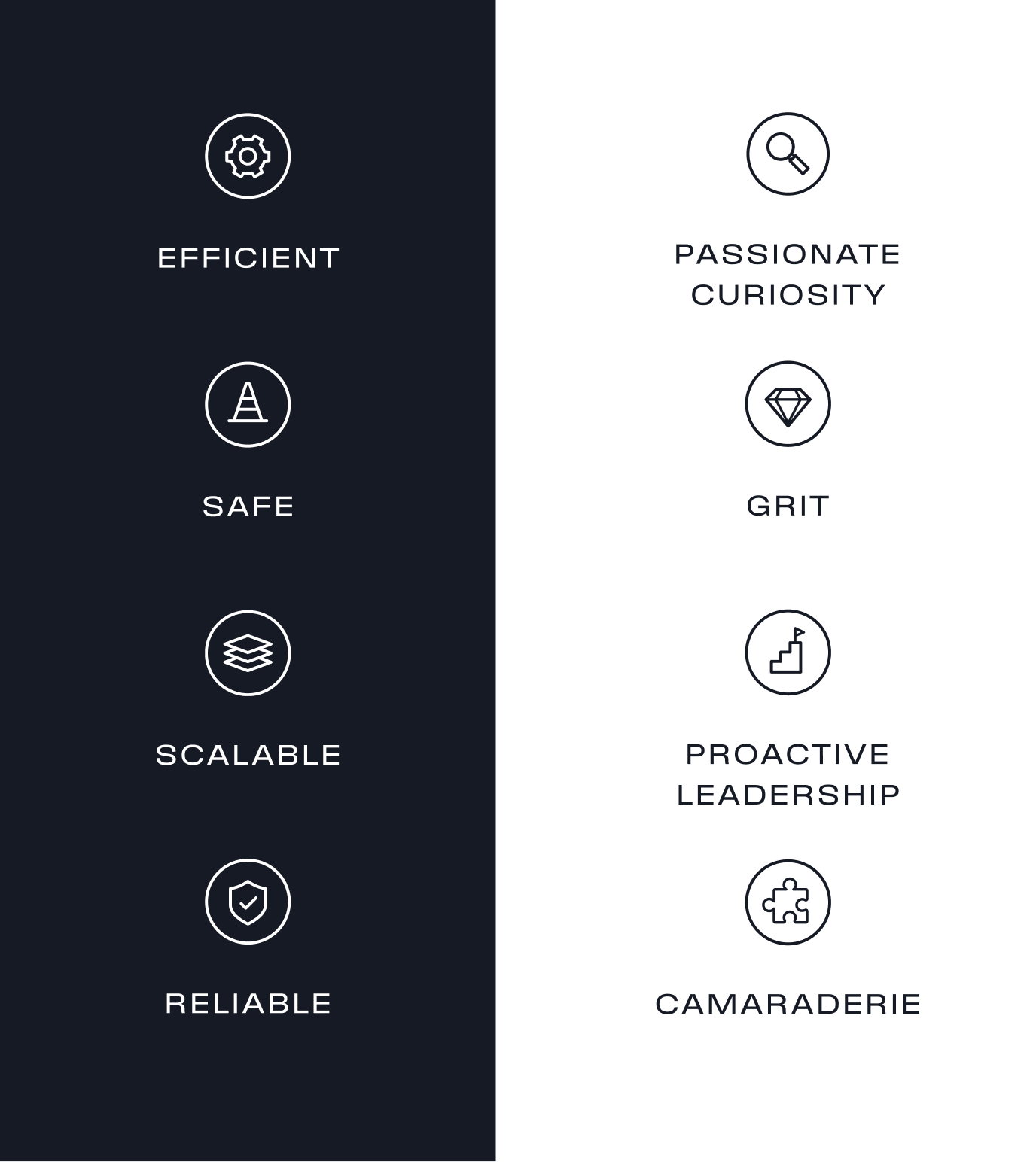
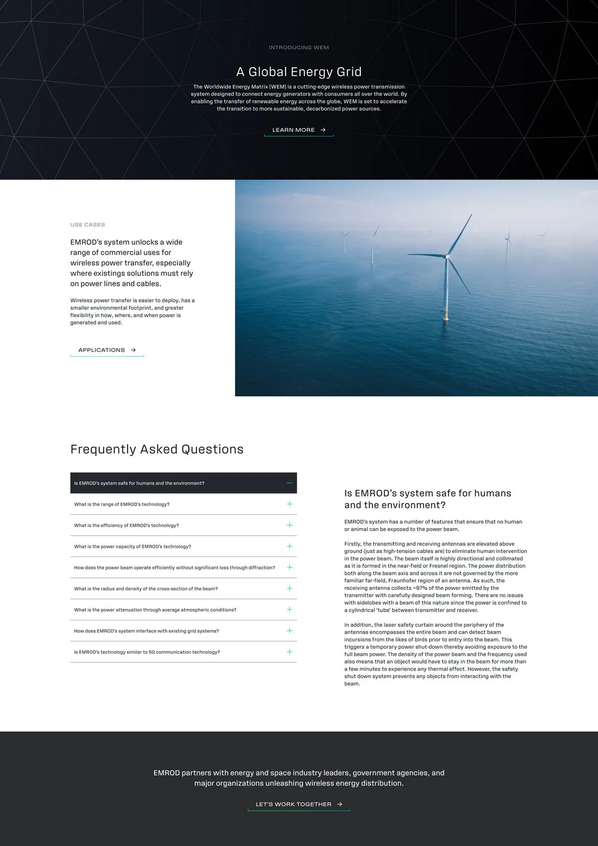
The owner and CEO wanted to feel like the other modern, disruptive brands of today. We recommended lots of photography, a line style on illustrations and iconography, a modern sans serif, and a restrained supporting color palette.
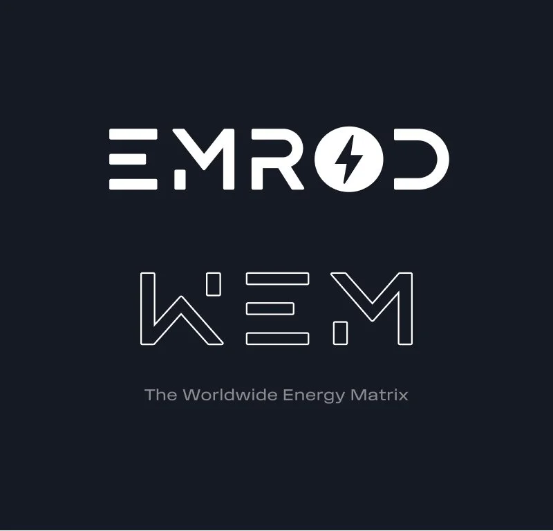
New WEM (Worldwide Energy Matrix) logomark, created based on existing logo
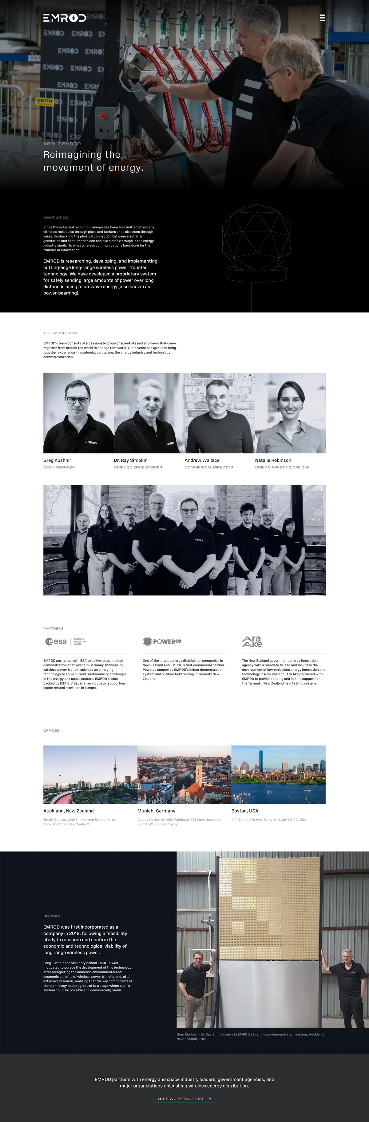
Photo Editing
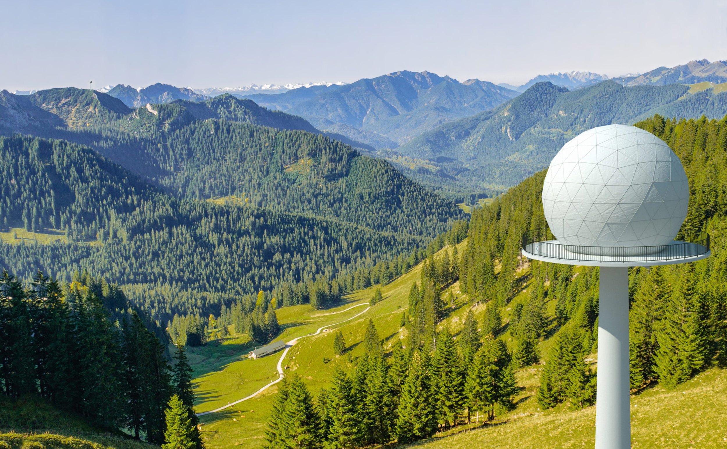
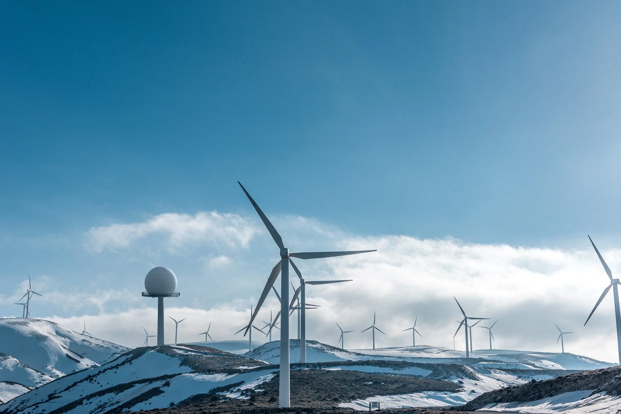
EMROD provided a few renders of the relay tower concept. I chose photos of remote settings to place the towers in, and adjusted the lighting using Photoshop.
If you look closely you can find a very distant second relay tower in two of the images below.