Client
_
Services
_
Synopsis
_
Brand Identity
Collage Illustration
Logo Refresh
Web Design
Project InnerSpace
Project InnerSpace is the leading independent organization dedicated to rapid global development of geothermal energy. They bring together the financial resources of climate-conscious donors with the technical expertise and infrastructure of the oil and gas industry, creating a powerful alliance to pursue a sustainable geothermal energy future.
Project InnerSpace: Provided original logo
Logo Refresh
While working on the overall rebrand, I recommended a general simplification of the existing logo. I streamlined the artwork, lowered the color count, and removed some decoration from the text. The reduction in colors especially opened up the range of possible supporting colors in the brand palette.
Brand Identity
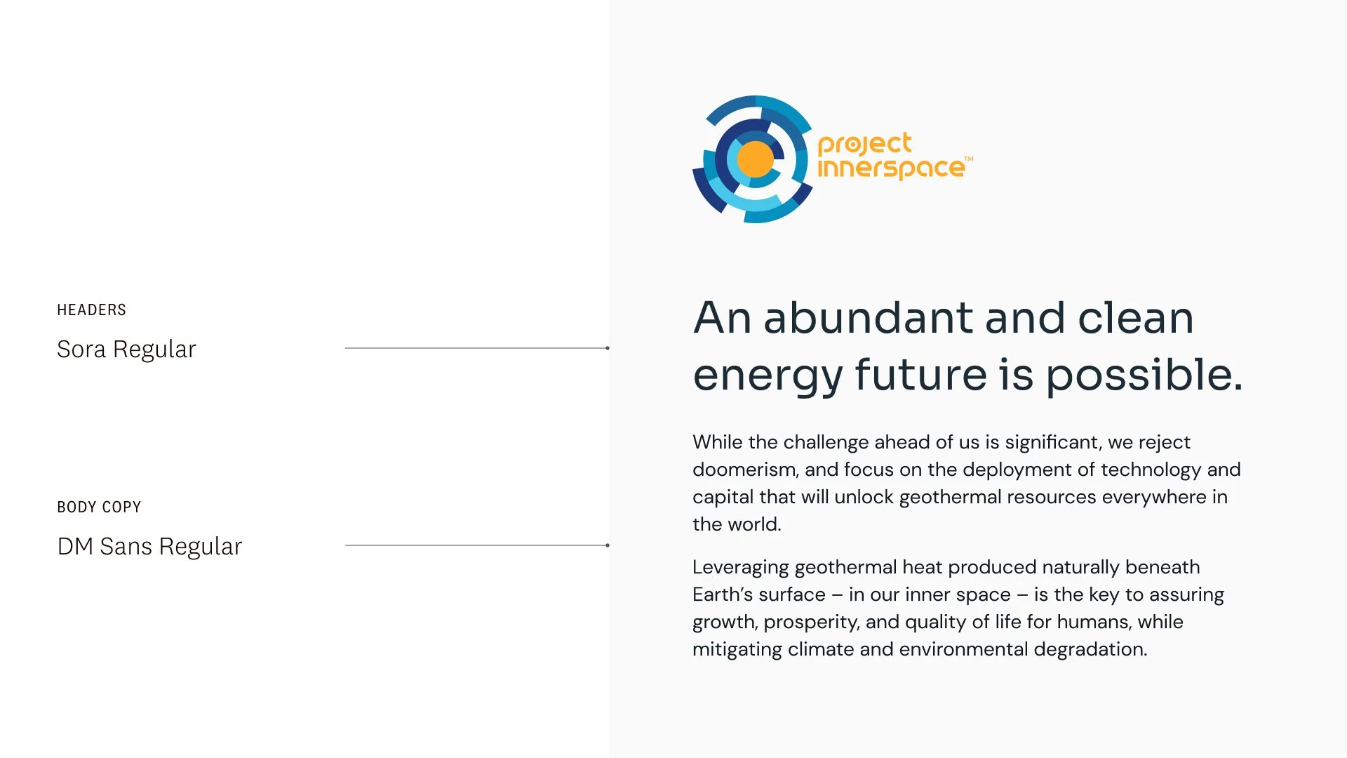
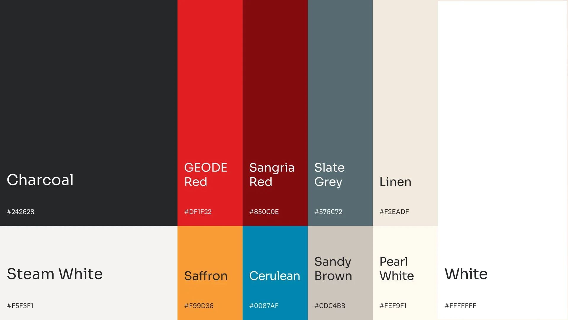
I pulled the goldenrod from the logo to be used as the brand’s call-to-action/highlight color, and kept the range of blues exclusive to the logo. The brand’s midnight blue is a darker shade of the darkest blue.
The client desired a font with a bit of a tech bent, but approchable. The Sora typeface, with its rounded corners and tall x-height was deemed a good fit. We also enjoyed the thematic coincidence: “sora” means “sky” in Japanese, the overlap of inner space and outer space.
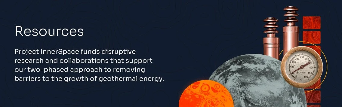
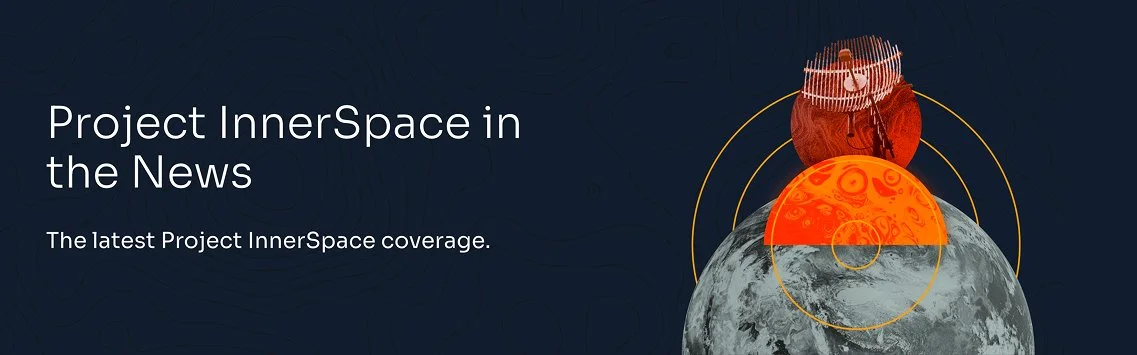
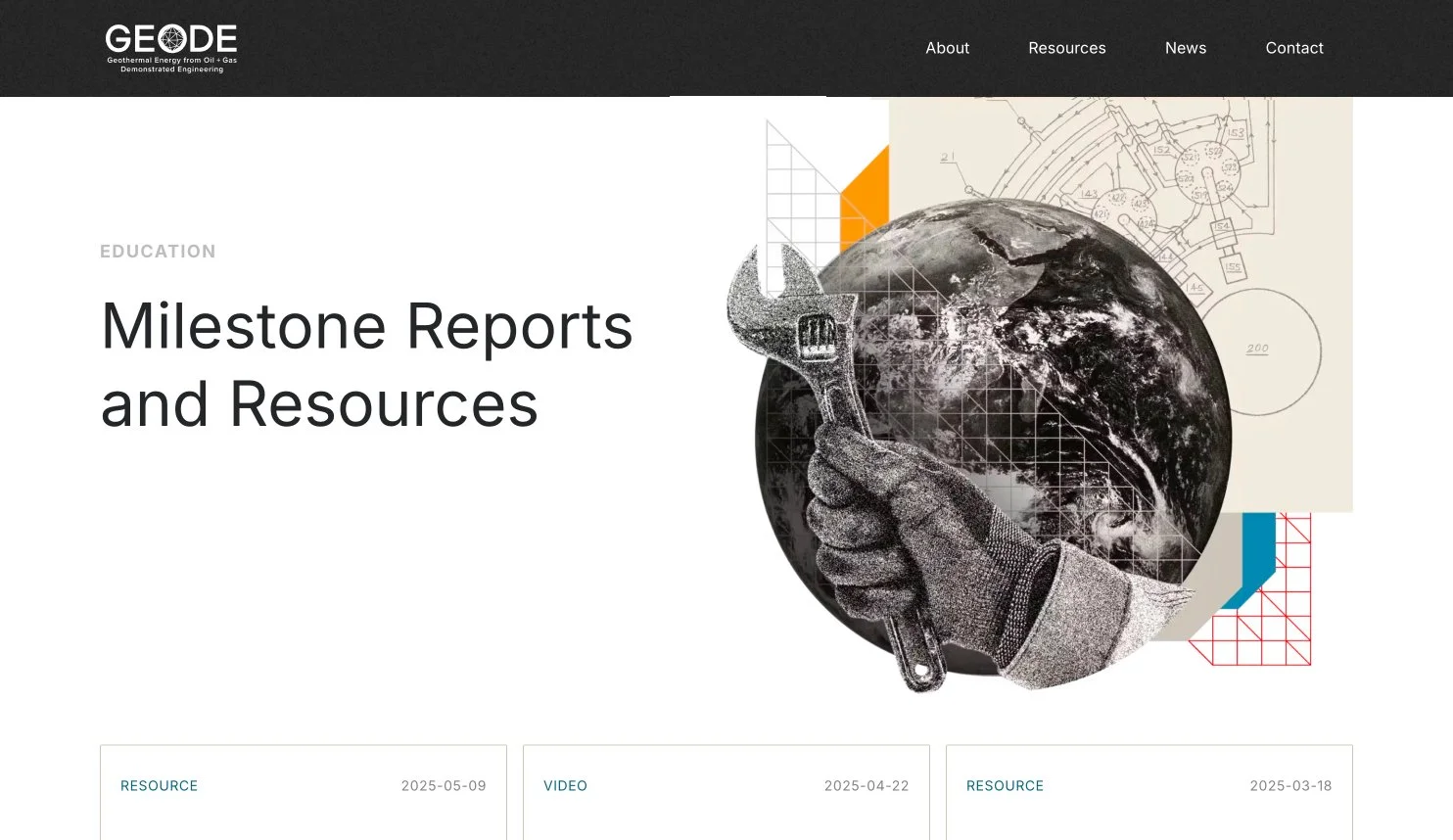
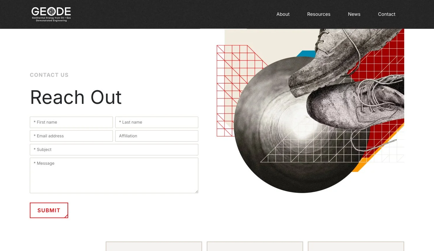
Website + Collage
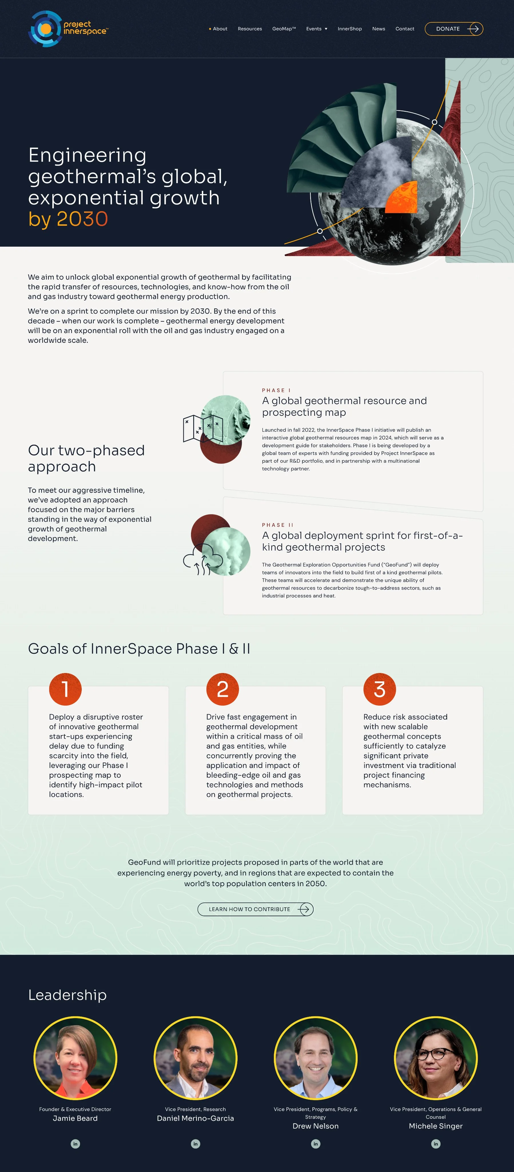
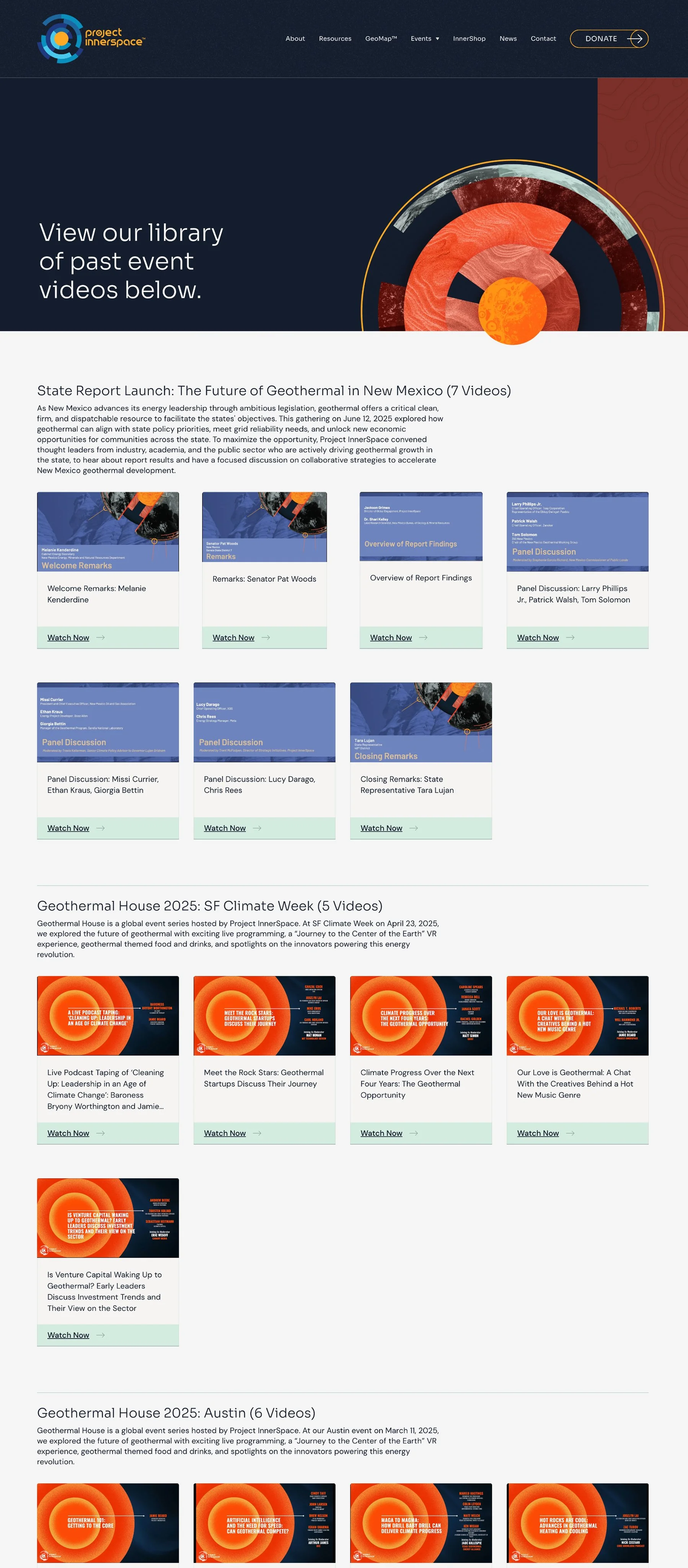
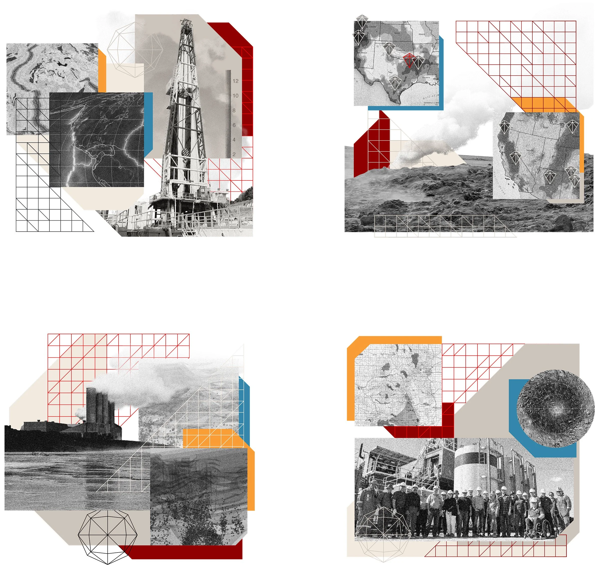
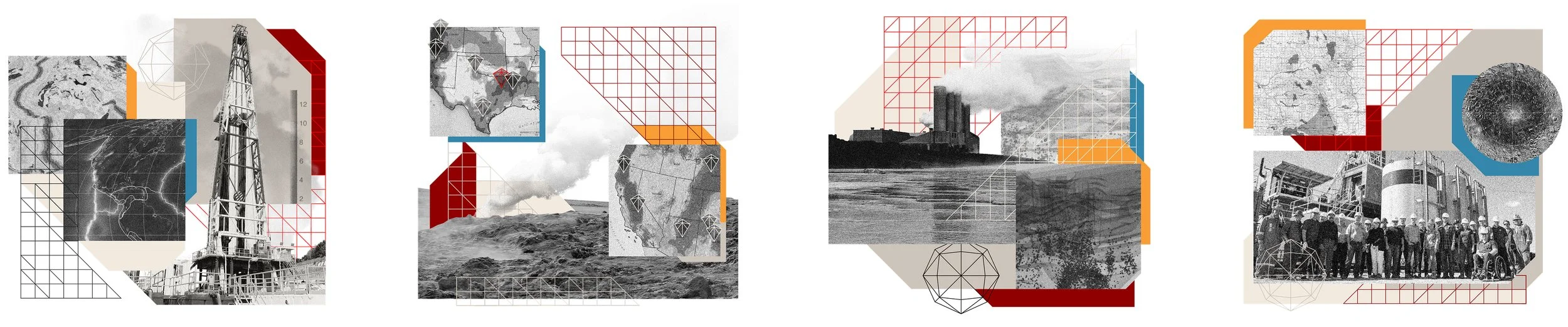
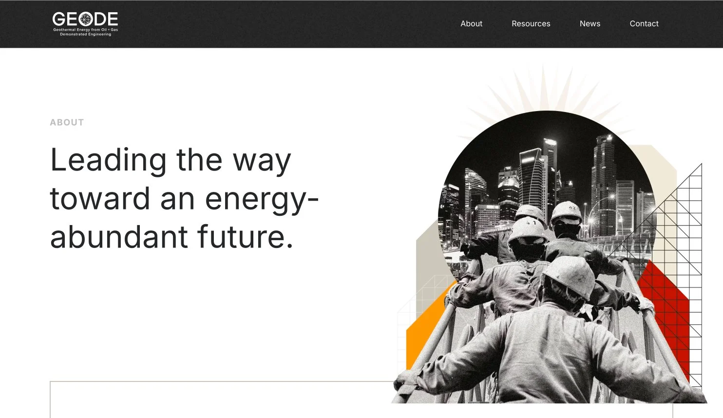
As a part of the web design process I created a digital collage for each page’s hero, often repeating elements (earth, earth’s core, textures, circles), but each having a unique layout and theme.
These collages were provided to the client, additionally broken down into individual elements for creating new collage illustrations in decks or other brand collateral.
Client
_
Services
_
Synopsis
_
Brand Identity
Collage Illustration
Logo Refresh
Web Design
GEODE
Continuing our partnership with Project InnerSpace, we created a brand and website for GEODE, a new government collective. Project InnerSpace was heavily involved as a founding partner and member of the consortium.
GEODE works to be a catalyst for geothermal innovation. They bring together subject-matter experts and pre-existing (and highly applicable) technologies from both the oil + gas and geothermal industries to research, develop, and deploy geothermal technology.
GEODE: Provided original logo
Logo Refresh
As a part of the brand creation, I recommended some small updates to the existing GEODE mark.
After exploring some other polygon options we went with the simplest update: Reversing the existing polygonal shape, I applied it directly as the negative space of the “O.”
I also updated the fonts used in both the wordmark and the accompanying locked up text, and center-aligned everything. The final version did not include mention of the DOE.
Brand Identity
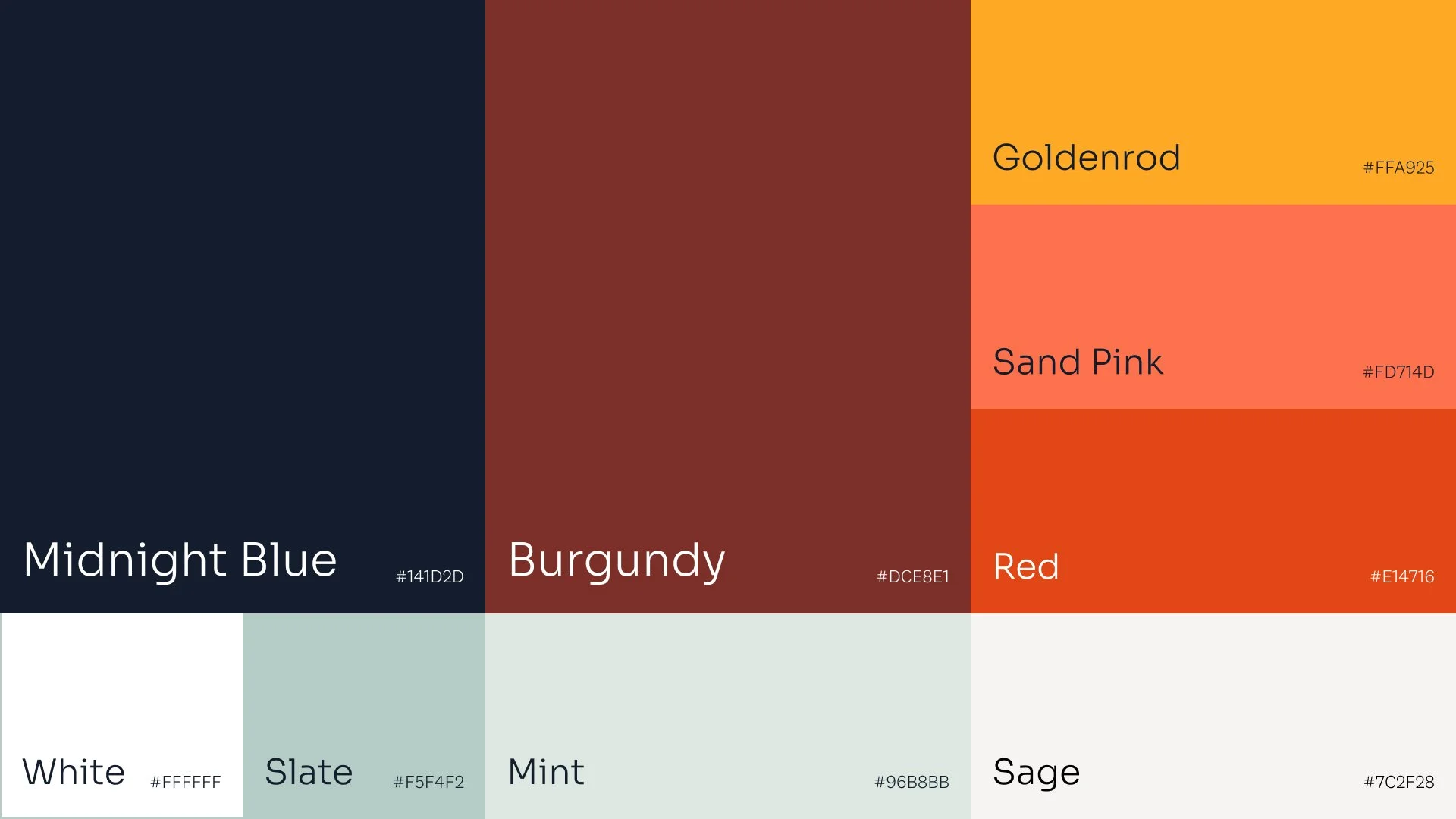
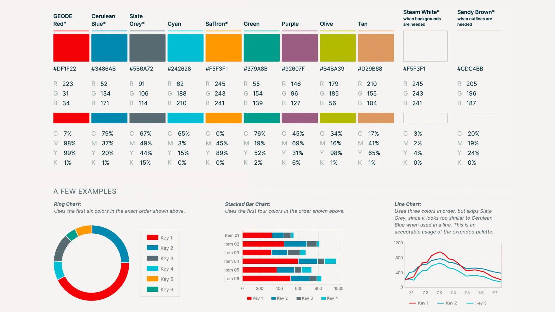
Red is a strong color often associated with the oil + gas industry. This visual association appealed to the consortium members, so many of our explored palettes included red.
Once the palette was settled, an extended palette was later provided for use in data visuals.
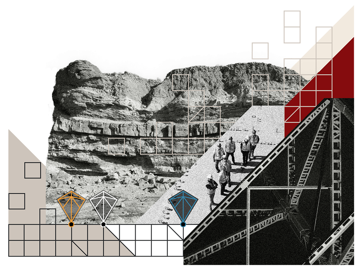
Website + Collage
Similar to Project InnerSpace, I created a digital collage for each page’s hero. I created additional collages for cover pages of the annual digital reports.
Hey!
You’ve reached the last project.