GREATER CHICAGO GIVING DAY: Campaign
An annual day of concentrated giving; the strategy around a day like this is similar to a day like Giving Tuesday, but created specifically for the Greater Chicago Food Depository. The campaign included a series of emails (before, during, and after the day) and a social media campaign to drive donors to the microsite. Strategic Consultant: Tara Mermis
Microsite and landing page for Giving Day. This is the version of the page that appears before May 8th.

A quick wireframe sketch to get my thoughts down. No scope for digital wireframes.

Donation form, before and during Giving Day. Donors can see which neighborhoods are donating to inspire friendly competition.
(click to zoom) Map of truck routes for microsite, email campaign, and social frame.

A animated graphic representing people contributing from all over the city.
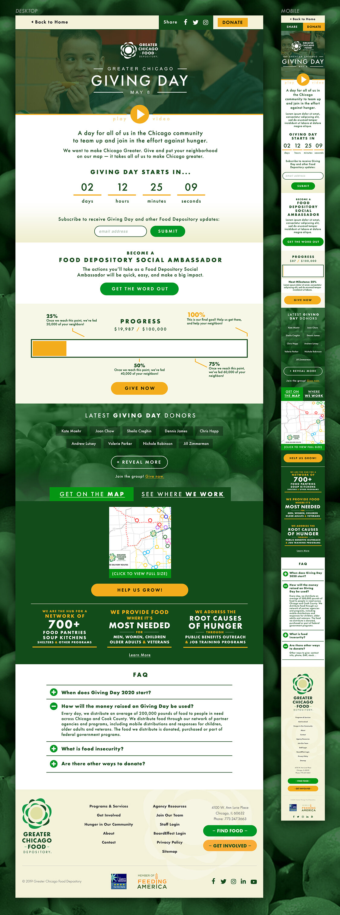
Thermometer representation of the fundraising match goals for the campaign.
FALL IMPACT
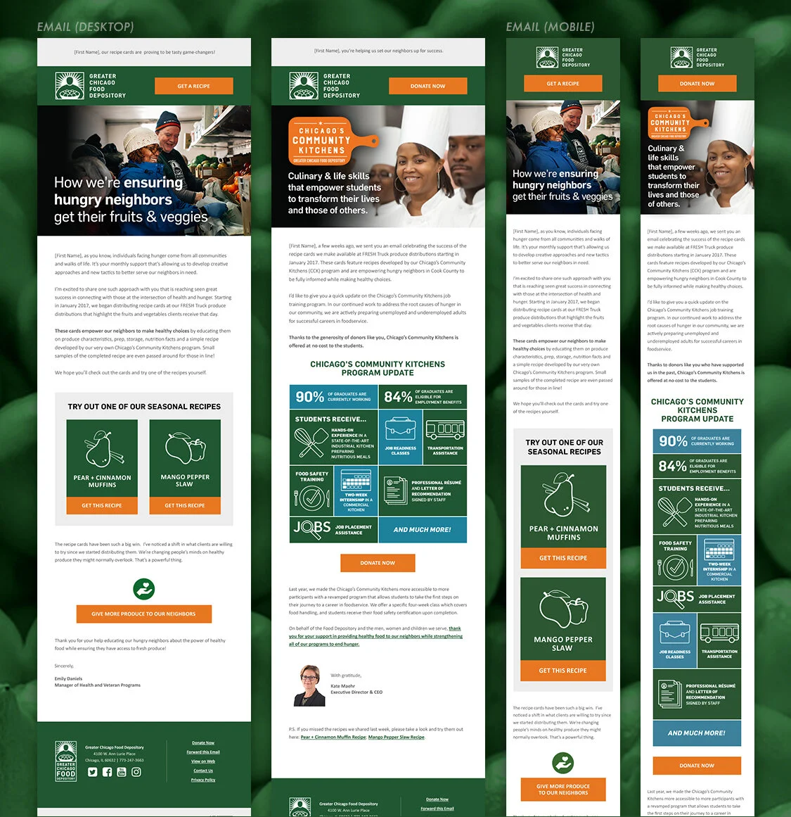
The Depository sends out a high-level donor report every fall (slightly different from their Annual Report), showing the direct impact of their donors’ dollars. We created a custom landing page in 2018 and 2019 to show off the impressive statistics and hard work of the Depository from the past year. The email and webpage were fully responsive.
Depending on the type of donor the user is, the webpage has some conditionalized content (iconography at top, CTA at the bottom of the page).

2018 email and landing page.

The 2019 site had animations and subtle fly-in scroll effects as the user scrolled down the page.
HUNGER ACTION MONTH
Hunger Action Month (started in 2013) is an annual campaign from the nonprofit Feeding America, created to raise awareness around food insecurity in the United States. GCFD participates every September. I worked on both 2018 and 2019; these are the 2019 digital assets I had a hand in.

2019 landing page with icons.

Email campaign, website lightboxes, and social media (Instagram dimensions shown). I made sure that the clipboard graphic could be responsive using tables; my developer (Lee Jaster) was always up for anything.
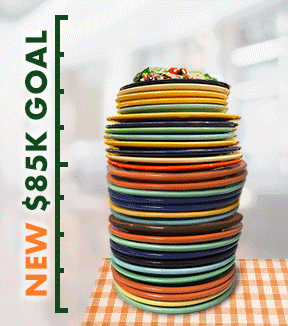
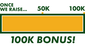
Animated assets from the Hunger Action Month email campaign. Quite a bit of photoshopping went into the stacked plates graphic (using free assets), and I’m pretty proud of how they both turned out.
OTHER CAMPAIGN ASSETS
We did a lot of great work with the Depository. I’ve selected a few more smaller things I love below.
2018 SPRING APPEAL
I had fun with these responsive illustration and infographic email graphics. I made sure they broke down well on mobile (again, kudos to my email developer, Lee).
Email 1 and 2, showing mobile-friendliness.

I liked these illustrations so much, I made a couple more, tried out a different color scheme, and posted them on Dribbble.
CHICAGO CANSTRUCTION
“Canstruction is a unique world wide charity which hosts competitions, exhibitions, and events showcasing colossal structures made entirely out of full cans of food.” (credit: Canstruction website) The event’s proceeds (and canned food!) benefit the Depository.
We supported the Depository digitally in 2018 and 2019, creating an email campaign, pushdown banner/homepage lightbox, and social media campaign to gather votes, helping manage the event site (Wishpond platform). I even helped report the voting results. Here are a couple of social media assets from 2019.
THANKSGIVING: Digital Assets
2018
A portion of GCFD’s pre-2019 color scheme lent itself to an autumn color palette, so I took full advantage in their Thanksgiving campaign.

2018 Thanksgiving campaign assets.

Detail of the illustrated assets
2019
GCFD’s rebranded color scheme was more of a slant rhyme for autumn colors. They approved slightly altered colors as a result.
I chose white oak leaves since the white oak is a local tree in the Chicago area, well-known for its autumn colors.

2019 Thanksgiving campaign assets.

The client liked the leaves, and asked for the vector assets to use in other contexts. Here’s a peek behind the curtain (the Illustrator file I passed over).
